Kotak Securities is a part of Kotak Mahindra Bank Ltd which has headquarters in Mumbai, India. Established in 1994. It deals specifically in capital markets. Kotak Securities offers a macroeconomic outlook and provides fundamental and technical analysis of stocks to investors. It aims to become a preferred equity investment partner by offering seamless trading experiences for their customers by providing technologically advanced platforms and insightful research studies.
The Objective:
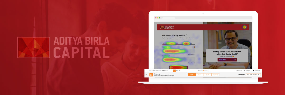
- Analyze user behavior
- Identify the pain points in the website
- Implement CRO to make the website more user-friendly
- Add Call to Actions where ever possible
- Drive more conversions
Key Results of Conversion Rate Optimization Software:
- The result of applying conversion optimization increased by 42% more user engagement.
- Increase in the number of new users by 15% who opened an account through the website
- Increased conversions without incurring any extra cost on advertising.
The Solution:
Initially, the page not found page was just a collection of images which didn’t include any call to action. Notify Visitors introduced a call to action, which was nothing but a text box. It suggests that the website will get back to you if you enter your details. This resonated well with the audience and increased the number of people who entered their data.
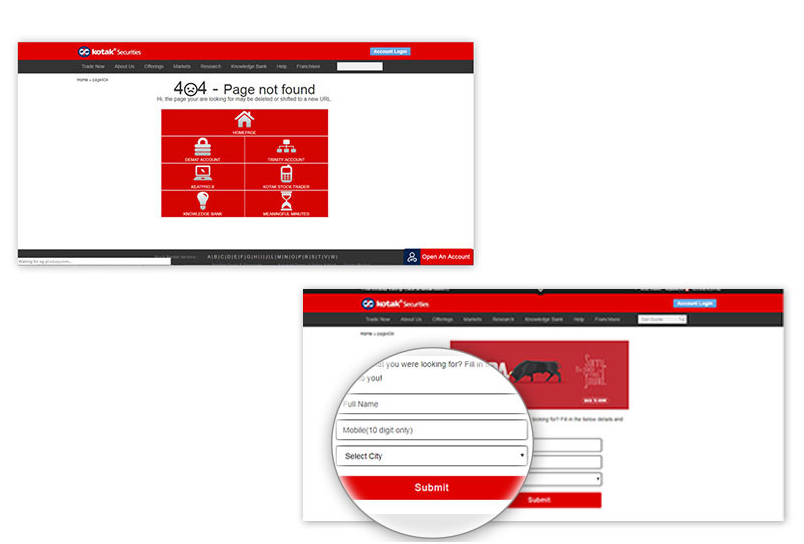
1)
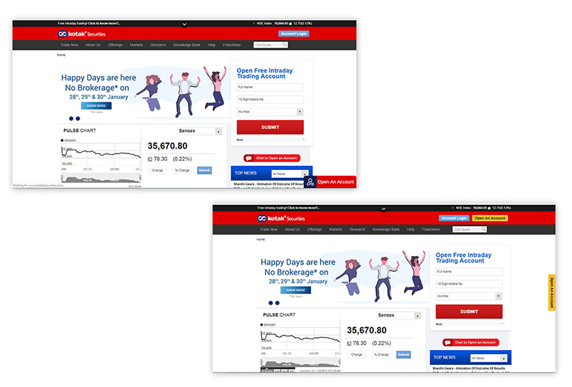
On the join us page of the website, initially the “Open An Account” button was near the account login button. NotifyVisitors designed a new button which was at the lower right corner of the page. This is logically the correct position for the CTA. Since the user would finish reading the paragraph and directly click on it. This increased conversions considerably.

2)
Also, the same was done on Home Page. The red button for opening an account is more welcoming as compared to the yellow button used before. This attracted the visitors whose main purpose to come to the website was to open an account. This reduced the time they took to take the action by making the process straight forward.
3)
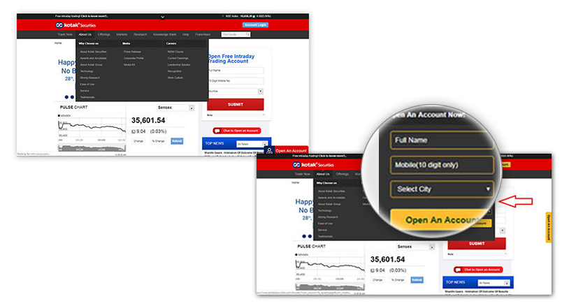
The about us dialog box which initially included some buttons were not directly linked to an actionable step was modified to include the “Make an Account” dialog boxes which increased the conversions manifold.
Conclusion:
Conversion rate optimization software helped Kotak Securities to reach its objectives. The number of accounts being opened increased by about 15% just by tweaking certain design elements of their website.
NotifyVisitors achieved this without even changing the code of their website. They just added this code on their own systems and it got reflected on Kotak Securities website. This is how much the NotifyVisitors system is user-friendly and easy to implement. Kotak took benefit from our services. You can too!
QUICK LINKS

 Email
Email SMS
SMS Whatsapp
 Web Push
 App Push
 Popups
 Channel A/B Testing
  Control groups Analysis
 Frequency Capping
 Funnel Analysis
 Cohort Analysis
 RFM Analysis
 Signup Forms
 Surveys
 NPS
NPS Landing pages personalization
  Website A/B Testing
  PWA/TWA
 Heatmaps
 Session Recording
 Wix
Wix Shopify
 Magento
 Woocommerce
 eCommerce D2C
  Mutual Funds
 Insurance
 Lending
  Recipes
  Product Updates
 App Marketplace
 Academy


