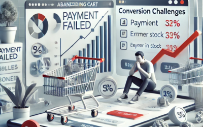
Web Design Tactics: How to Ensure Your Product Resonates With Your Target Audience

How do you get your leads to convert into satisfied (and loyal) customers?
How do you get your leads to convert into satisfied (and loyal) customers?
Well, there’s no doubt that you need to develop the best solutions in the market. You also have to deliver an unmatched customer experience. And a hefty marketing budget can’t harm either. However, most businesses overlook one element of a successful sales strategy: demonstrating a complete and in-depth understanding of their audience’s wants and needs.
Ultimately, to ensure your product resonates with your future customers, its benefits have to align with their expectations. And what better way to achieve that goal than to use tried-and-tested web design tactics to emphasize the right info to boost web visitors’ purchase intent?
So, if you’re willing to employ web design to boost conversion rates, here’s how to ensure your product resonates with your target audience.
Use Product Animations in Your Header Image
What’s the best way to communicate user benefits? You might think it’s to optimize your copy to make it clear, accessible, or engaging.
But the truth is, the human brain isn’t necessarily wired for verbal communication. Instead, data suggests that people react much more intensely to visuals.
According to research, about 90% of the information the human brain processes is visual. People comprehend images 60.000 times faster than text. Finally, visuals boost learning capacity by as much as 400%, demonstrating that they’re exceptionally powerful at elevating product understanding.
One of the best ways to use this knowledge when deciding on your web design strategy — especially when prioritizing product understanding and messaging relevance — is to give sufficient space to visual elements. Even more importantly, it’s essential to position these elements in attention-grabbing spots, such as the website header, where they have the highest chance of engaging (and impressing) visitors.
Although incorporating product images in your site header is an excellent way to ensure your products appeal to your target audience, consider exploring more advanced formats.
Product animations, for instance, are a wonderful step up from static imagery, as they offer all the benefits of video without sacrificing load speed or UX.
With this in mind, it’s no surprise that all kinds of businesses rely on product animations to elevate comprehension, aspirational value, and purchase intent, regardless of whether they’re selling physical products — like Loro Piana — or digital solutions — like Minup.
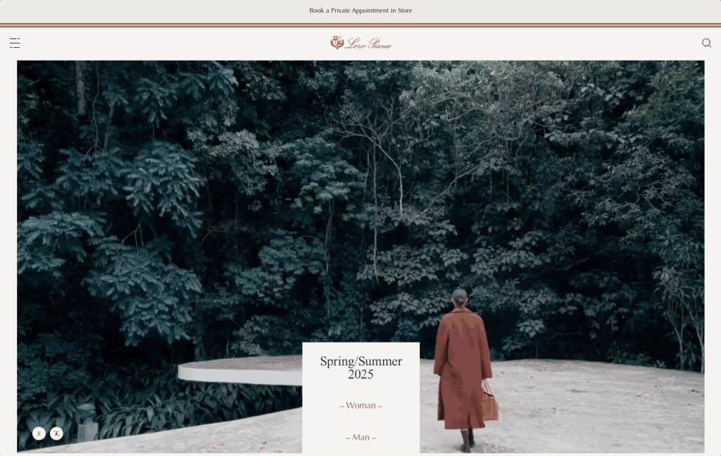
Source: loropiana.com
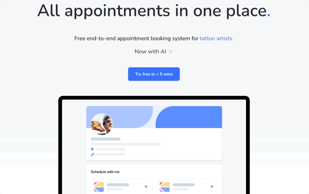
Source: minup.io
Don’t Cram Product Features into a Single Page
One of the more common web design mistakes brands make is failing to understand that different segments of the same target audience often have contrasting wants, needs, and priorities.
So, while one part of your web visitors may care about a specific product attribute, another could potentially not assign as much value to it.
With this in mind, one of the best ways to guarantee your product resonates with your audience is to avoid cramming product features into a single page. Instead, design multiple product feature pages and dedicate each to a specific attribute or use case.
That way, you won’t just avoid overwhelming potential customers with irrelevant info. You’ll also make them more likely to recognize the benefits of your offer, elevating their purchase intention and making it easier to convert them into customers.
For example, check out how Dial My Calls does this on its Text Survey Tool page. Instead of trying to cover all of its complex product features on the homepage, the brand created a separate page for each use case and attribute. This way, Dial My Calls avoids overwhelming web visitors with information that may not be relevant to their unique needs. Moreover, it creates a space to go into as much detail as necessary to present and explain specific product benefits, helping prospects understand how those benefits relate to their unique pain points.
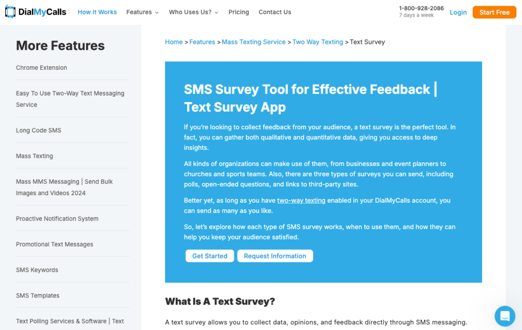
Source: dialmycalls.com
Avoid Clutter by Collapsing Product Info Under Meaningful Headings
Cluttered web design isn’t just unattractive. It can also seriously harm your conversion rates. In a recent survey, 93% of web users cited cluttered design as a reason they would stop interacting with one website and switch to a competitor’s.
However, while a reduction in conversions is worrying enough, it’s not the only drawback of a cluttered web design.
From a UX point of view, having too many elements on a page can cause web visitors to overlook crucial product info that could otherwise convince them to convert. Naturally, you can implement the above mentioned strategy to solve the issue. However, that may not be an option for your business.
Do you want to guarantee that your product resonates with your target audience? Why not employ formatting tactics to highlight core product benefits while retaining sufficient detail to ensure product understanding?
By collapsing key product info with meaningful headings, you can ensure that web visitors notice the primary benefits you offer. Perhaps more importantly, you allow them control over how they consume product info.
Essentially, incorporating collapsible product feature headings into your web design is more than just a great method to maintain a streamlined browsing experience. It’s also a great way to encourage in-depth product research (which is a prerequisite for customer satisfaction) by allowing prospects to zoom in on the info they consider relevant, and that could help convince them of your solution’s effectiveness at addressing and removing their pain points.
Check out how Somewhere, a company that assists in hiring international employees, implements this web design tactic on its homepage. By explaining the onboarding process step-by-step, this brand allows web visitors to scan the info to get a general idea of how the service works. Furthermore, it invites them to take a deep dive into how each step functions with a straightforward “+” button that reveals additional info about the brand’s services and how they relate to the overall customer experience.
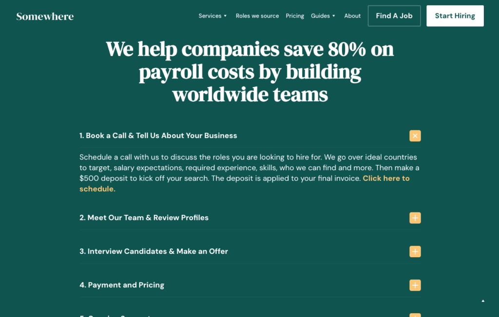
Source: somewhere.com
Provide Very Short Product Scope Descriptions for Skim-Readers
While we’re on the topic of scanning web pages, it’s essential to understand how people (don’t) read online.
According to research spanning the past 20+ years, about 80% of web users don’t read online content word-for-word. Instead, they scan pages until their eyes land on seemingly relevant key phrases or visuals, and then they dedicate their attention to the area surrounding those keywords.
So, to optimize your website for this common user behavior, it’s essential that you know how to highlight bite-sized, high-value information that will immediately communicate your solution’s effectiveness and make your prospects want to convert.
Check out how Eden Emerald, an Australian property buyers agent, does it on its homepage. By using illustrated badges along with keywords, this brand makes it crystal clear that it offers a versatile property concierge service to Australian real estate buyers. The offered value instantly resonates with web visitors, making it much easier for EE Buyers Agent to convert new customers with this simple web design tactic.
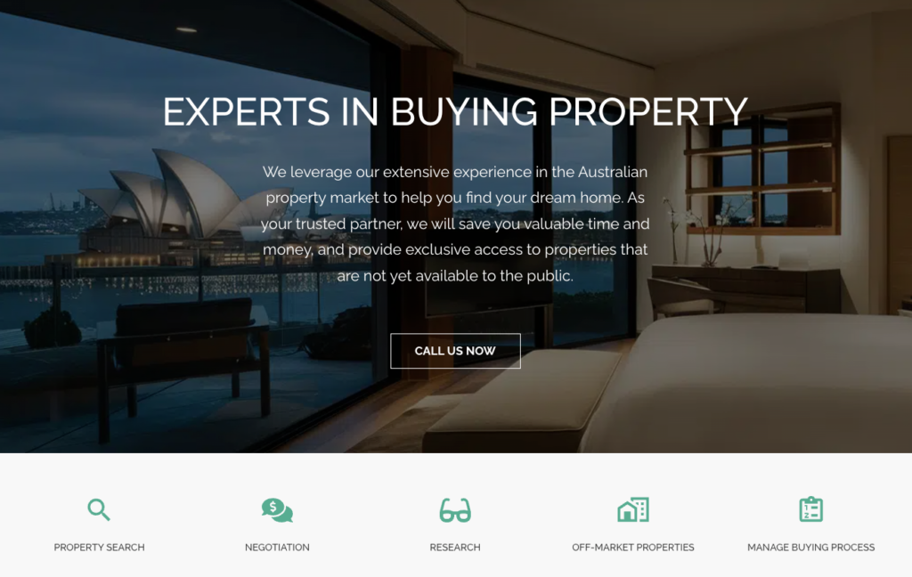
Source: eebuyersagent.com.au
Highlight Social Proof That Gives Granular Product Information
Social proof is an exceptionally valuable web design element — especially when done right.
After all, most consumers seek out reviews and ratings before buying. They also actively use this content to evaluate products, determine their relevance, and confirm a brand’s credibility.
Of course, not all social proof is created equal. For instance, although ratings can tell a lot about the value you offer, they’re not always sufficient to paint a complete picture of customer experience.
With this in mind, it’s essential that you highlight the right social proof. And, if you want to genuinely appeal to your ideal customers, consider addressing their unique needs when choosing what customer feedback to point out.
For instance, if you check out the Blueland homepage, you’ll see that one of the featured reviews highlights compact storage as one of the product’s main benefits. This is such a unique yet common customer requirement that mentioning it in such an attention-grabbing manner is almost guaranteed to convince a specific audience segment to convert.
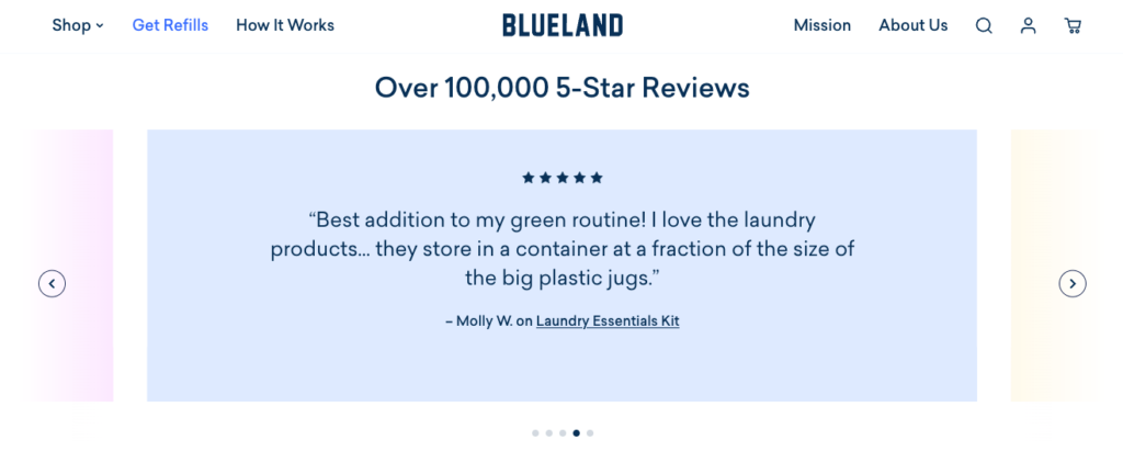
Source: blueland.com
Another example to look at is Classical Guitar Shed, a classical guitar training site. This is another business that uses design to accentuate granular social proof to elevate product attractiveness. Instead of just underlining generic user feedback, Classical Guitar Shed gives space to in-depth reviews that mention very specific benefits — such as the accessibility of the program, the enjoyable experience, and the ways customers have used it to reach their unique guitar-playing goals.
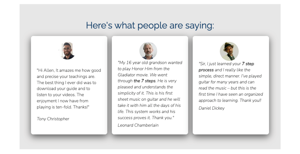
Source: classicalguitarshed.com
Ensure Product Features on Your Pricing Page Are Understandable
Finally, as you explore web design strategies to ensure your product resonates with your target audience, don’t forget to adapt your site’s appearance to how consumers make purchase decisions.
According to some of the latest data, 91% of consumers want to choose solutions that give them the best value for their money. So, it’s no surprise that they will spend a solid portion of their buyer’s journey browsing your pricing page.
But here’s the deal. Most pricing pages aren’t that great at presenting product features in a way that prioritizes product understanding. And that could be a hurdle in ensuring your offer resonates with your target audience.
That’s why it’s extremely important that you use web design to maximize product comprehension when mentioning features on these pages.
One way of doing this is with tooltips. If you check out Harvest, you’ll see that the brand provides sufficient information about unique software features, ensuring potential customers comprehend how they work and consider their benefits when making purchase decisions.
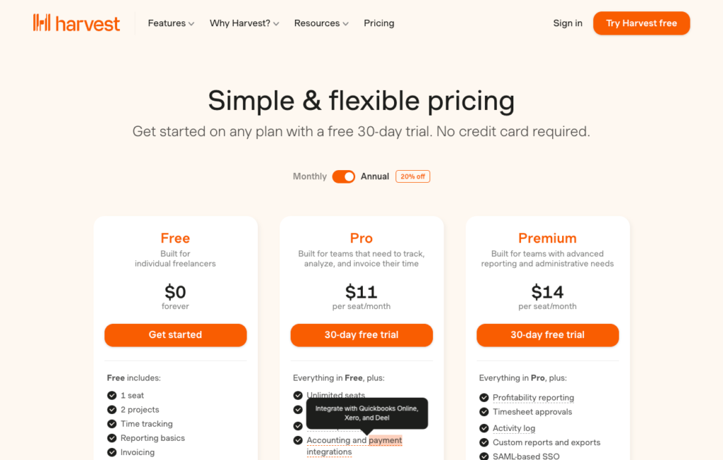
Source: getharvest.com
Or, for an example from an ecommerce brand, check out Apple. This business lists each product’s technical specifications on product collection pages, knowing how important performance is to its buyers and understanding that its target audience will want to check CPU and GPU core performance before committing to a specific product version. So, instead of forcing web visitors to click through to multiple product pages, Apple does its best to streamline the selection process by highlighting the exact features and benefits each product option offers.
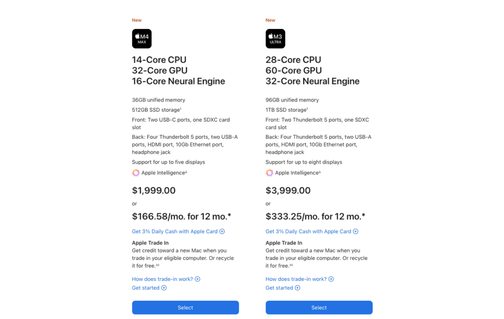
Source: apple.com
Final Thoughts
Using web design to ensure your products resonate with your audience is one of the most effective methods of elevating conversion rates and customer satisfaction.
Of course, to do it well, you first need to form an in-depth understanding of what your prospects want and expect. With this in mind, don’t just try to recreate the web design strategies covered in this article. Instead, do your best to collect high-quality customer data. Then, use that data to make web design decisions that will offer the highest possible chance of success.