Do you want to build a system to proactively reconnect with your disengaged customers and provide them with the incentive they need to keep them engaged on your site or blog? Well, re-engagement emails can help you do that. Re-engagement emails are one of the most cost-effective marketing strategies.
Whether it’s refreshing an older contact or awakening subscribers who have forgotten all about your brand, re-engagement messages offer many great benefits and convert more customers than ever before! In this article, we’ll explore 17 of the best re-engagement email examples from leading brands.
Contents
Best Re-Engagement Email Examples
1. Blue Apron: “Come back for these exclusive recipes.”
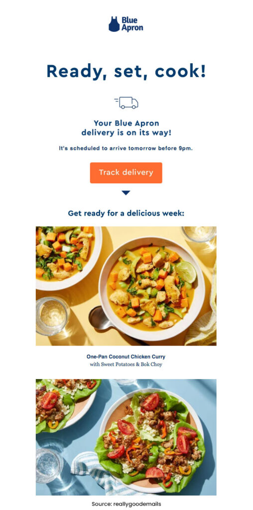
Blue Apron’s approach to winning back customers is one of best re-engagement email examples. When their emails hit the inboxes of deactivated users, they don’t immediately start bugging them to resume their subscriptions.
Instead, Blue Apron opts to showcase mouth-wateringly delicious and vibrant photos featuring recipes that could have been enjoyed had the user not cancelled service in the first place! While there was an acknowledgement at the footer level requesting a return with ‘come back and cook with us’, it was enough to make any foodie feel tempted by FOMO (fear of missing out) no matter how seasoned or loyal a customer may be.
2. Laura Belgray: “Are we over….”
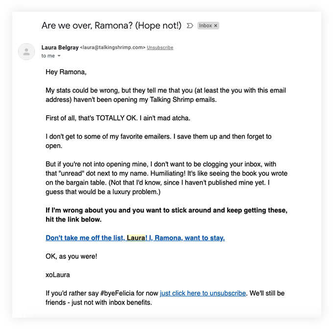
Laura Belgray certainly lives up to her reputation! With a combination of humour, friendliness and sincerity in every email she sends, it’s no wonder that we’ve always been so impressed by her work.
In this example, Laura gives us the perfect amount of gentle persuasion without ever being pushy or intrusive – allowing customers choices while simultaneously reassuring me with unmatched authenticity.
3. FabFitFun: “This will perk you up ;).”

FabFitFun knows how to coax its customers with the allure of new, exclusive perks. Their re-engagement email reminded me that the customer was missing out on some awesome features – and just as a bonus, they provided a limited-time offer of a complimentary mystery bundle (valued at $125!) when resubscribing!
4. Moe’s Southwest Grill: “Just checking in….”

Rather than resorting to discounts and gimmicks, Moe’s Southwest Grill shows they care with a friendly “check-in”.
The fun design includes playful animated text message bubbles and emojis that make you feel like an old friend instead of just another customer.
5. Circle Furniture

With its friendly and understanding approach, Circle Furniture makes it easy for you to keep control of your overflowing inbox.
Rather than scolding customers for being unengaged, they provide a simple solution with the ability to update email preferences – so that only relevant messages get through.
6. Hired: “Action Requested: Your Hired application is missing information.”
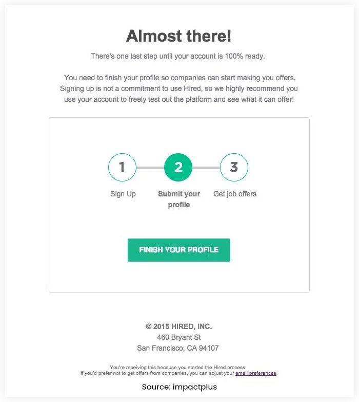
In this example, Hired makes it easier to take the next step in your job search! With an eye-catching design, they’ve created a simple and effective one-step process that will have you applying for offers before you know it.
Their use of green highlights how close you are to completing registration – so don’t delay any longer and start exploring new opportunities today!
7. Duolingo: “We Miss You!”

Duolingo’s re-engagement email examples are a clever and effective way to get users back on track with their language learning.
These five-minute lesson reminders won’t go unnoticed, featuring a bright green mascot sulking at the bottom of an ever so slightly guilt-inducing message.
A bold orange button awaits you when it comes time to ‘get back on track’ – just what every procrastinator needs in times like this. So don’t hesitate – to see how far your foreign language skills can take you!
8. H&M: “Here’s 15% off to say we miss you.”
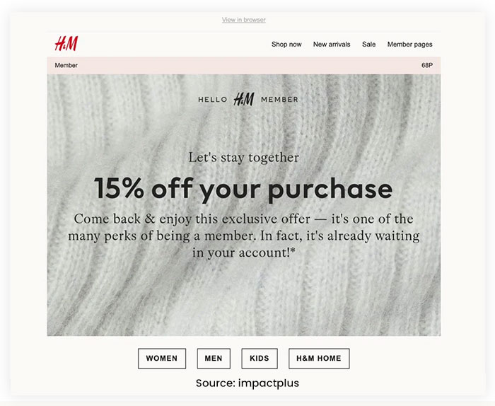
With the push of a button, online retail therapy has been an unexpected saving grace for customers over this trying period of social distancing. H&M realized it too and sweetened their offer with 15% off their next purchase as an opportunity to “stay together” despite being apart!
9. Kickstarter: “The power of updates.”
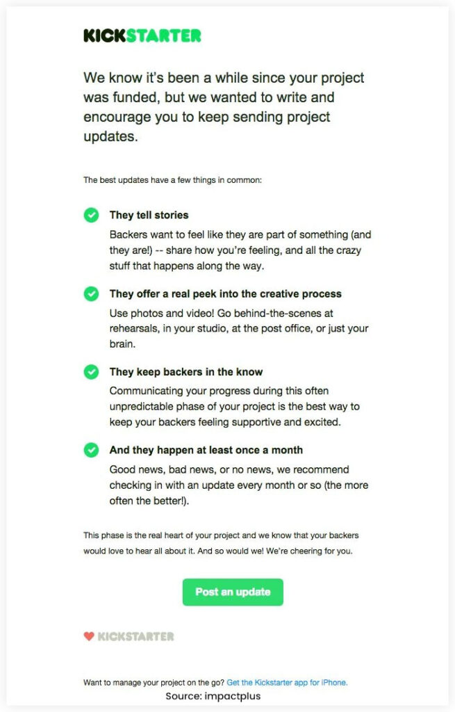
After a successful Kickstarter campaign, the platform sends a special email to celebrate and give users tips for further success.
The message cleverly uses lime green bullet points in its design and an eye-catching call-to-action that ensures viewers don’t miss out on reading important advice from the company itself. It’s no surprise that this is one of our favourite emails!
10. Express: “Here’s free shipping to get what’s in your cart!”
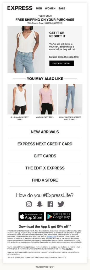
Express understands its customers’ needs and provides an experience that keeps them returning. With a friendly reminder of the items in their abandoned cart and FOMO-inducing messaging to “get it or regret it,” Express has created a powerful incentive for shoppers who need extra motivation.
To sweeten the deal even further – they offer free shipping on orders placed within 48 hours! On top of all this convenience, similar products are conveniently suggested, so you don’t miss out on any amazing deals. Smart move, indeed!
11. Path
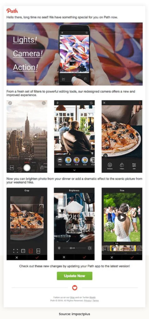
Path gives users a visual incentive to come back and discover its latest updates in its re-engagement email. With bright, attractive visuals highlighting new features and the countless possibilities of photo editing, returning can give you access to powerful options like never before!
12. Hubspot
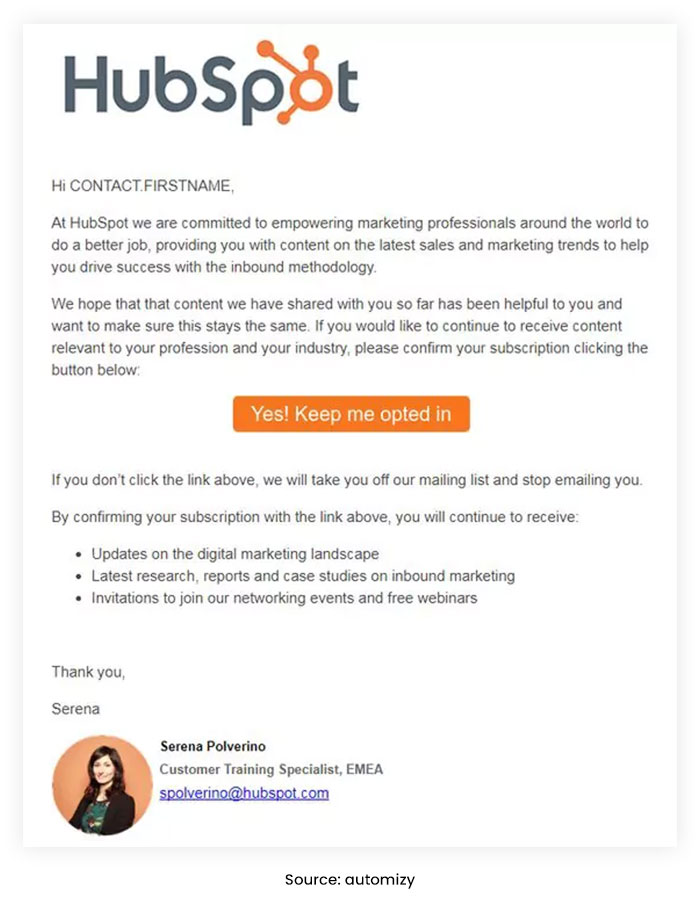
B2B re-engagement initiatives are essential for maintaining strong relationships with contacts. One of the best ways to accomplish this is by allowing them to confirm their opt-in status through a simple click on your Call To Action (CTA).
As shown in this re-engagement email from Hubspot, providing subscribers with information about what they can expect when confirming their subscription can help set expectations and maximize engagement potential.
13. Starbucks
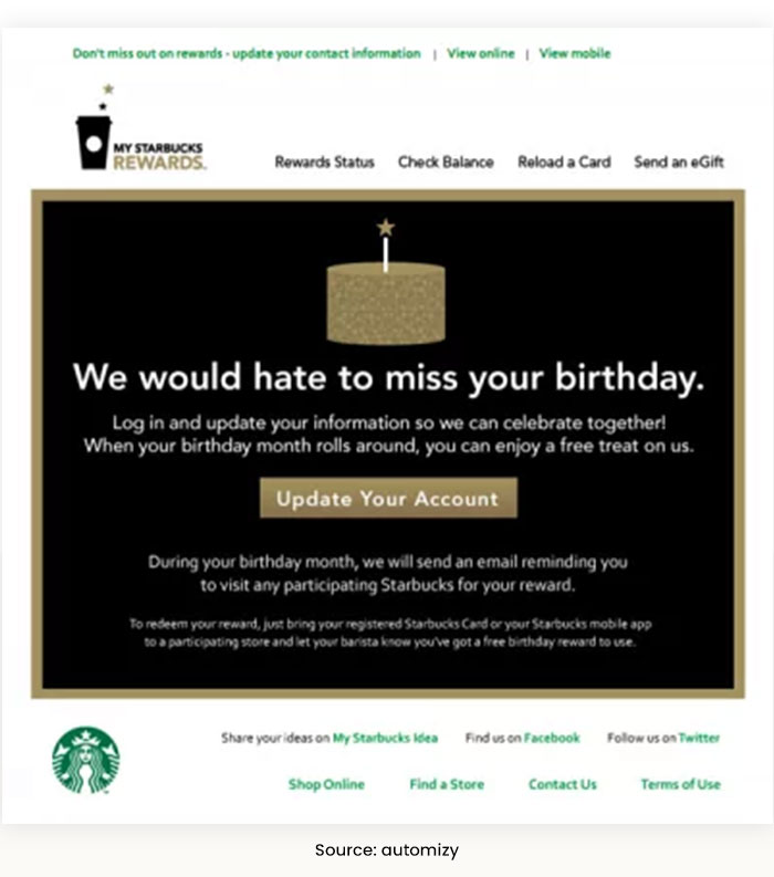
Take your customer relationships to the next level by celebrating their special day! Shower them with a unique present that will make them feel like royalty and rekindle their interest in interacting with you. With our festive email design, they’ll know how much impact they have on your business – it’s time for the birthday party celebration to begin.
14. Disney+

The streaming platform uses holiday nostalgia to win deactivated users back in this re-engagement email. Capture the joy of the holiday season and re-experience your favourite moments with a renewed subscription to our streaming platform.
From classic Christmas films and special seasonal TV episodes to festive specials – this is your chance to reconnect with timeless nostalgia. Don’t miss out on bringing back all those wonderful memories at home!
15. Ma-ka-rohn

Here we have cart abandonment email example. The sweet treat you’ve been eyeing is only available for a short time – don’t miss out.
Ma-ka-rohn’s limited edition macarons are crafted with love from their small family business. Enjoy the delicious indulgence while supporting this local venture before they’re gone forever!
16. Charming Charlie

Time is of the essence when it comes to Charming Charlie’s rewards. Through vivid imagery and copy, they let you know that your reward won’t last forever—plus, there are two fun ways to redeem it right away! The email design pops with an un-brand look which gets its inspiration from their vibrantly organized stores by colour. Hurry now…the clock’s ticking!
17. ReturnPath: “Get an extra life and keep your emails going.”
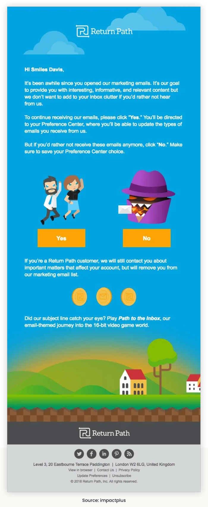
This email company isn’t taking any chances when it comes to staying in contact with their contacts – they’re making sure that everyone can clearly see the button they should click by using a full, custom-illustrated design.
But here’s where things take an even more interesting turn: if you don’t want to stay subscribed anymore and instead choose “say farewell,” this cleverly designed message is a subtle promotion of one of the brand’s games! So rather than completely opting out from communication, there may still be another way for recipients to engage within their world.
Conclusion
Email re-engagement campaigns are a great way to bring inactive subscribers back into your sales funnel. If you’re looking for some inspiration, check out these re-engagement email examples from top brands.
With the right mix of personalization, value, and urgency, you can win back even the most inactive subscribers and get them engaged with your brand again.
NotifyVisitors helps you design enticing re-engagement email marketing campaigns so that you can generate better outcomes. If you also want to launch an email campaign, then consider scheduling a free demo.
FAQs
1. What are the Re-enagement Emails?
A re-engagement email campaign help engage those customers segment who are less engaged with your emails. These emails are also known as win-back emails or reactivation emails.
2. What are the Some of Re-engagemnet Email Campaigns Best Practices?
Here are a few benefits for launching this campaign:
- Segment your inactive users
- Keep your email personalsed as much you can
- Focus on emotions
- Leverage FOMO, urgency and scarcity.
- Offer a gift.
Also Read:
- Email Marketing Analytics – Track, Measure, and Report Campaigns
- Email Marketing Best Practices to Improve Campaign Conversion Rate
- Top 10 Email Marketing Templates to Increase Conversion
- Top 10 Email Marketing Trends You Must Know
- Best Small Business Email Marketing Strategies for Better Conversion


 Email
Email SMS
SMS Whatsapp
 Web Push
 App Push
 Popups
 Channel A/B Testing
  Control groups Analysis
 Frequency Capping
 Funnel Analysis
 Cohort Analysis
 RFM Analysis
 Signup Forms
 Surveys
 NPS
NPS Landing pages personalization
  Website A/B Testing
  PWA/TWA
 Heatmaps
 Session Recording
 Wix
Wix Shopify
 Magento
 Woocommerce
 eCommerce D2C
  Mutual Funds
 Insurance
 Lending
  Recipes
  Product Updates
 App Marketplace
 Academy

