Email marketing is one of the most powerful marketing channels, especially for ecommerce businesses. However, you must create an opt-in email list to use email marketing.
Sending unsolicited messages to a prospect’s email can hamper a sender’s reputation and image.
But unlike outbound marketing strategies where marketers promote to the market, opt-in is a more targeted, effective, and ethical approach.
In opt-in marketing, prospects agree to obtain a company’s content. This content includes advertising, newsletters, offers, and so forth.
In this blog, we will learn to opt-in email definition, benefits, best practices and examples.
Contents
What is an Opt-in?
Email opt-in refers to the registration method marketers utilize whenever someone signups up for their email newsletter. This procedure can be either single or double.
In the first case, subscribers will be instantly added to a list after clicking on the “subscribe” button. Second, recipients must verify their email address through a confirmation email sent minutes after registering.
Single Opt-In Email
As the name implies, this process needs only a single action to turn a visitor into a new subscriber. This signup process is popular with eCommerce sites that like to collect numerous visitors’ email addresses to get them to buy.
To comprehend why the majority of online stores prefer this method, let’s have a look at the pros and cons of single opt-in:
Pros
- Expand your subscriber list fast.
- Minimize visitor frustration due to the requirement for extra steps.
- Instantaneous access to the promised value (discounts, offers, etc.).
Cons
- Poor email list hygiene.
- Your sender score might be impacted by spam complaints.
- Legal compliance issues in distinct countries.
Double Opt-In Email
The double signup process entails including an additional step to verify your visitors’ email addresses. One of the most important benefits of selecting this method is its ability to prevent fraudulent acts and build a healthy email list. This process is widespread with many businesses, including SaaS companies, agencies, and online stores.
Instead of obtaining a marketing message, recipients will get a transactional campaign in the form of a confirmation email. Now, let’s have a look at the pros and cons of setting up a double opt-in process:
Pros
- Support email list hygiene.
- Have a good email deliverability score.
- Gather quality contacts.
Cons
- Longer registration process.
- Subscribers might feel irritated by the extra step.
- They must confirm their email address to obtain any messages.
So Which Opt-in Process Is The Best?
As you can see, both methods have their pros and cons. If you want to increase your list fast, you can select the single opt-in approach, but you should be prepared to deal with unverified recipients and spammers.
On the other hand, setting up a double process will provide you with better engagement rates and conversions, but the extra verification step might irritate visitors and slow your growth. Again, it’s up to you and what you want to accomplish!
Best Practices for Creating Opt-in Emails
1. Do not ask for too much information
Several marketers made this common mistake during the Opt-in. If you ask for too much info during the Opt-in process, it will be a turn-off for individuals since they care for their privacy. Also, they may require more time to fill out all the necessary information.
Moreover, remember to leave a positive impression as you approach your visitor for the first time. Therefore, the best practice is to ask only for the most relevant details, such as their email address and first name.
2. Opt-in form should be visible to your visitors
There is no rule on where to put the opt-in form on your website, but ensure that it is at the right place that is visible to your website visitors. Top bars and exit popups work nicely in capturing visitors’ attention. Sidebars, although a popular spot, often yield
3. Tell your users what to expect from your emails
Whenever a user signs up to obtain marketing messages, setting expectations and keeping visitors clear is essential. This contains what to predict and the frequency at which they would like to obtain the emails. By doing this, you ensure your visitors that they will receive something valuable in their inbox and won’t be spamming.
4. Make sure to add a Privacy statement
One of the main issues marketers encounter is that visitors are hesitant to share their personal information during the opt-in process.
This is mostly because of fear that their information might be misused or the company will spam their inboxes. The best practice to do so is by incorporating a privacy statement that puts them at ease. While showing the privacy statement, ensure that you give your viewers confidence that any data they share is secure.
The language should be carefully chosen so that you leave no room for error and make a favorable and genuine impact on the would-be subscribers.
5. Use social proof to give your customers confidence
By utilizing social proof, such as showing the number of subscribers, you could show your visitors that others are signing up. So make sure you leverage social proof to excite customers about the opt in.
6. Make use of a form for Opt-In
The issue with utilizing a link to your opt-in page is that you create extra hassles for a smooth sign-in. This is because the users must first click the link, go to the Opt-in page, fill in the information, and click the CTA button.
Instead, when you show your users the form right on the home page, they can fill out all the necessary information and click the submit button. Poor results.
Since the results differ depending on several factors, such as the website layout, you could perform A/B testing on different locations to find the most suitable placement for your form.
7. Include customer segmentation
Marketers should know one important thing: your audiences are at distinct conversion funnel stages. What works for one audience will not work for the other. So it is important to make sure you pick the right method depending on the audience. You can segment your subscribers based on their behavior.
8. Be creative with your subscribe button
While designing the subscribe button, ensure you utilize your creativity as best as possible. For instance, companies usually include ” subscribe ” in the subscribe button. However, this might appear repetitious and unappealing to your customers.
Instead, you could use various creative words to attract your users’ attention to click the CTA button.
9. Offer discounts for visitors who sign up
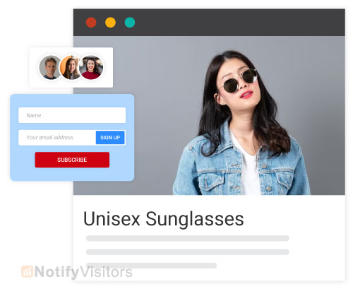
One of the main reasons why your visitors sign up is that they wish to receive certain incentives. This is particularly true for eCommerce websites.
Along with being enlightening and informational, lead magnets enable your subscribers to save money. Therefore, giving discounts through Opt-ins can help you gain more subscribers in the long run.
What are the benefits of opt-in emails?
- Increased Engagement: Subscribers who have opted in are genuinely interested in obtaining your emails, leading to higher open rates, click-through rates, and overall engagement.
- Improved Deliverability: Email service providers (ESPs) prefer senders with high engagement rates and low complaint rates. Opt-in emails help you build a positive reputation and better deliverability for your future campaigns.
- Stronger Brand Relationships: Opt-in subscribers are more open-minded to your messages, promoting trust and loyalty. This allows you to build stronger relationships with your audience and demonstrate yourself as a thought leader in your industry.
- Targeted Communication: Opt-in lets you segment your audience based on their interests and tastes. This enables you to send targeted emails that resonate with each subscriber, further enhancing engagement and conversions.
- Compliance with Regulations: Many countries have regulations like GDPR (Europe) and CAN-SPAM (US) that require user consent for receiving marketing emails. Opt-in ensures compliance with these regulations, avoiding legal issues and potential penalties.
8 Opt-in Email Examples
These opt-in email examples will guide you on structuring and positioning your emails for the most impact. So let’s check them out.
1. Modern Me Boutique

This Modern Me Boutique opt-in email template is a creative way of gathering email information. It’s more creative and interactive than most popups.
Here, the prospects can spin the wheel to win a prize. To spin the wheel, they have to enter their email address.
This form does not push people to purchase. But instead, it focuses on the reward the customer earns rather than what they have to give. It’s also quite bright and visually appealing.
2. All Birds
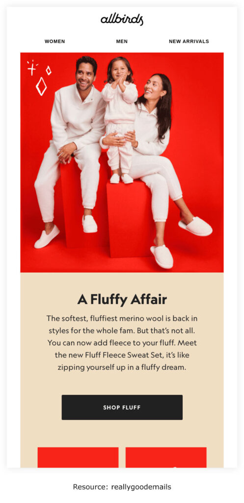
With ecommerce marketing, you can sometimes offer discounts when gathering information for your opt-in emails. Instead, you can utilize All Birds’ approach and get the visitors thrilled about all the email updates they will get.
Making use of discounts can create an expectation in your customers’ minds that you may not always be able to meet.
This opt-in email template swears the audience that they’ll be alerted whenever there’s an intriguing sale, which is compelling enough to get them to sign up.
All Birds utilizes the opt-in form in different ways, including popups. The example is of one embedded on their home page.
Also, this email opt-in words do well as they develop a sense of exclusivity in subscribers’ minds by asking, “want first dibs?”
3. Distorted People
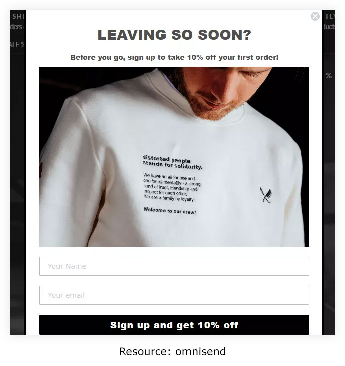
This is one example of opt-in email marketing that utilizes an exit popup signup form. With exit popups, the opt-in email marketing software tracks the cursor, and when the visitor appears like they like to exit the site, an opt-in email form occurs. Businesses can hire nearshore developers to help create and implement effective exit popup strategies for opt-in email marketing.
It shows a 10% discount on the first order as an incentive for visitors who sign up.
In the popup, Distorted People keeps it straightforward. The form only requests the prospect’s name and email address. The call-to-action button is ingenious and could be clearer than simply asking visitors to subscribe.
4. Recess

This tiny popup on the bottom of the page on the Recess website is an incredible way to use forms to collect opt-in emails.
Unlike other popups, the positioning is perfect as it does not interrupt your visitor’s activities on your website. Rather, it occurs as a small box at the bottom of the site and takes up very small space on the page.
Recess also shows an incentive, a coupon code for customers to get 10% off their purchase.
5. Ripped Body

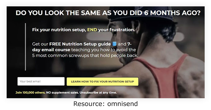
This website employs its homepage as a landing page to accumulate information for opt-in emails. Here are some things this opt-in marketing page does exemplary.
The first thing you notice on the Ripped Body site is a persuasive copy encouraging their fitness-enthusiast audience to fix their diet.
They then present a nutrition guide and a meal course to their audience who subscribe to their opt-in email list.
The copy also utilizes social proof to enhance its credibility. Finally, it suggests subscribers join an existing list of 100,000 people.
Further down, the landing page is more social proof in the form of statistics. All this counts toward their credibility, further strengthened by the clear opt-out option in the copy.
6. Frank Body
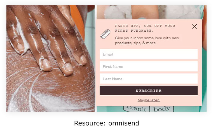
This site’s opt-in form examples pop up on the bottom left side of your screen a few minutes into browsing their website. This location is perfect, as it’s difficult to miss. The copy also lets visitors know what to predict if they subscribe: new products, tips, and more.
It shows an incentive–a 10% discount on the buyer’s first purchase. Since it’s the first thing visitors notice when they read the opt-in email form, they will likely be encouraged to purchase.
7. She Simply Shops
This is one example of how you can implant opt-in email forms on your website. The position can differ. For instance, you can have this at the base of every page, as shown above, or on the right side, as with the forms on blog pages. It offers visitors an extra opportunity to sign up.
The above opt-in email template is brief and only requests the subscriber’s email address. It also utilizes the “fear of missing out” phrase to make visitors sign up so they get access to the latest deals.
The opt-in email form also lets people know exactly what to predict when they sign up, and it does that upfront. In addition, visitors can anticipate promotional emails and other updates.
And they earn a 10% discount on their purchase.
Conclusion
After reading this blog, you may have understood what opt-in is and how to use it effectively for your business. Moreover, analyzing brand examples helps you understand how opt-in does well for them.
FAQs
1. What is an Opt-in?
Email opt-in refers to the registration method marketers utilize whenever someone signups up for their email newsletter. This procedure can be either single or double.
2. What Are Some Best Practices of Opt-in Emails?
Some of the best practices of opt-in emails are
- Don’t ask too much information
- Be creative with the subscribers button
- Offer discounts for visitors who sign up
- Include customer segmentation
- Tell users what to expect from your emails
3. What Are a Few Examples of Opt-in Emails?
Top 7 examples are
- Modern me boutique
- All birds
- Distorted people
- Recess
- Ripped body
- Frank body
- She simply shops
Also Read:


 Email
Email SMS
SMS Whatsapp
 Web Push
 App Push
 Popups
 Channel A/B Testing
  Control groups Analysis
 Frequency Capping
 Funnel Analysis
 Cohort Analysis
 RFM Analysis
 Signup Forms
 Surveys
 NPS
NPS Landing pages personalization
  Website A/B Testing
  PWA/TWA
 Heatmaps
 Session Recording
 Wix
Wix Shopify
 Magento
 Woocommerce
 eCommerce D2C
  Mutual Funds
 Insurance
 Lending
  Recipes
  Product Updates
 App Marketplace
 Academy

