We all know that conversion is a significant part of success for every website that sells a product or service. For instance, whenever people reach your website, they are simply visiting, but what happens during their visit will decide their actions.
Meanwhile, the conversion process should be happening, which is where you handle different aspects of your website to convert visitors into customers.
Sometimes, having a business is all about executing the long game and taking the small wins rather than the big ones.
Contents
What is a Micro Conversion?

A micro conversions is a little step a visitor takes on their path to your main conversion goal.
It’s a little but important action that confers that a visitor is on the right track, and interested in your company, eventually they could potentially become a paying customer later on.
This varies from a macro conversion, which “is the fulfilment of a primary call-to-action by your site’s visitors” (e.g., a sale).
While they may not lead to an immediate sale,micro conversions play a significant role in the entire customer journey and demands your attention.
After all, they can assist you better understand your consumers, enhance lead nurturing and build a better customer experience.
Now we understand what micro conversion is, it’s time to learn the tactics through which you can gain more micro conversion, that includes both process milestones and secondary actions.
11 Proven Techniques to Get More Micro-Conversion
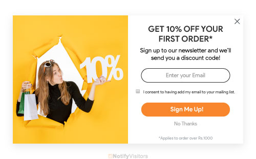
1. Make your email opt-ins super compelling

Email marketing is one of the most strong marketing strategies for eCommerce businesses—almost 81% of businesses trust email marketing as their main driver of customer acquisition.
Designing your email opt-ins interesting can push your visitors to subscribe to your list before abandoning the website. Once you own their email, you can forward them personalized browser recovery emails, discounts, and promo codes to edge them onto a purchase.
Emails are varied, from promoting new offers to sending cart abandonment reminders to building a connection by delivering brand values. What’s more, the Return on investment on email marketing is fiercely rewarding.
How to apply:
- Allow an incentive to your customers to give up their email id in exchange for a discount or an offer.
- Compose compelling copy that is bound to stimulate the interest of your visitors
- Adding a Hello Bar to your eCommerce page is crucial as it doesn’t harm your page speed and comes with different customization options.
- Offering email visitors their shopping carts (helps to hold 24% of abandoned cart visitors)
2. Push them to download a product catalogue
Product catalogues can be great tools to build interest and awareness around your eCommerce brand. They challenge the original problem an eCommerce business encounters in creating reliable leads. Moreover, they add to your brand authenticity and pave the path for later sales.
Customers are more inclined to download a product catalogue when they see value in it. Therefore, it pays off to produce relevant, high-quality content and use compelling ways to nudge downloads. After which, you can enable them to download it in exchange for building an account or signing for your emails. This will make sure that you get high-value leads in your database.
How to apply:
- Utilize a landing page if possible. They decrease distractions and enhance chances of conversion
- Try linking to the catalogue from your individual or group product pages
- Use appealing visuals, product videos, customer testimonials, and a strong CTA.
3. Make it simple for shoppers to add to the cart

For a buyer to purchase a product, they’ve to first add it to their cart. That primary step is what builds a connection and eventually leads to a sale. The more comfortable it is, the more likely it’ll change.
But, that’s not all. You have to make sure that the whole checkout process is easy, else you may be required to face cart abandonment.
Essentially, there can be several reasons that contribute to people abandoning their carts—the most common ones being complicated checkout processes, high shipping, or hidden prices.
Although, card abandonment is not bad as it shows that the customer is involved in your brand and your products. Therefore, they aren’t lost sales and can be converted in the future.
You can lessen your cart abandonment rate (and improve your add-to-cart session rates).
How to apply:
- Add a growth indicator to encourage shoppers to visualize the purchasing journey
- Keep shipping and other costs clear
4. Keep your forms simple and intuitive
Forms are great methods of getting micro conversions. But they’re not really fun to fill—from a buyer point-of-view.
Filling the same details repeatedly can be a pain. Form abandonment is real. But, you can counter that by making your forms simple and intuitive.
Depending on your purpose, you can determine whether to go for short or long forms, single-step or multi-step forms. A study by Venture Harbour shows that multi-step forms can improve conversions by 300%.
Using surveys can help you enhance engagement with your brand as they record user behavior for channeling macro conversions.
How to apply:
- Use a confined number of fields
- Make sure that it’s mobile-friendly.
- Enable users to fill only sections marked with an asterisk
5. Don’t be drab on social media
We live in a generation where social media serves as a consistent loudspeaker that magnifies your brand’s voice. According to a report, 90% of brands utilize social media channels for brand awareness. Therefore, influencer marketing has become such a rage that it can reach millions of people quickly.
The final outcome is to thicken your brand presence and build a strong sense of social proof among your potential customers.
When people start engaging with your business on social media, they’ll be more inclined to make a purchase from you down the road. So, step up your social media game, keep it straight to your brand, and most importantly, don’t be dull.
How to apply:
- Put up interesting content for your core audiences
- Use appropriate CTAs and link them to conversion channels
- Keep your brand voice intact for all interactions
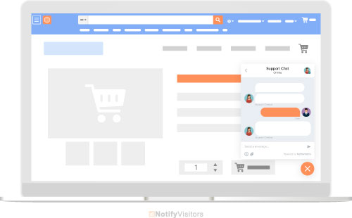
6. Offer live chat – but don’t be intrusive

A live chat is an amazing feature to insert if visitors act towards a bigger conversion. What a live chat with an agent does is that it takes away the annoyance of a long wait over call to fix an issue. It also eliminates the non-human element from automated chats.
Live chats further build trust in the minds of the customer. It symbolizes that there’s someone to solve their issues such as purchase, returns, or shipping.
With a live chat in place, the loss of motivation will cease to be a factor. Instead, the customers will be able to address the challenges quickly and move on to the purchase.
However, make sure to keep the live chat feature non-invasive. You desire it to be available for your customers if they require help and not in their way at any point.
How to apply:
- Allow 24*7 live chat service
- Keep the live chat option noticeable
- Add CTAs to empower users to take the desired action
7. Get them to explore more pages
According to research, the average number of pages browsed per session was 2.8. Furthermore, if the number was over 4.4, the website fell under the first 20% of sites.
So, you can assume that if a visitor opens more than 3 of your website pages, it’s a great sign. Such high-level actions go a long way in improving micro as well as macro conversions.
That said, it is most helpful to be wary of high engagement but low conversion pages. It usually means there’s some issue with the site.
You can utilize several tools such as heatmaps to record visitor sessions and analyze. It’ll also let you identify navigation pain points and resolve them with UX changes.
How to apply:
- Highlight more important information across the website.
- Build a visible top menu with multiple options.
- Concentrate on more personalized and user-generated content.
8. Make your search bar prominent – particularly on mobile
Yet another important micro conversion step is utilizing the search function. Unfortunately, many eCommerce sites don’t run out of this feature well, and as a consequence, lose out on people needing to browse through. That is exactly why it is so essential to make your search bar prominently visible.
A well-highlighted search button and area with a suitable CTA can move visitors to go farther into the underlying product pages of your website.
If a visitor utilizes the search button, they believe your brand is looking for something to purchase.
How to apply:
- Design clear search categories
- Use filters to encourage users to narrow down
- Incorporate selectable autosuggestions for faster search results
9. Give them reasons to create an account
Account signups grant you a scope to personalize your site to your customer’s interests. As you remember, personalization can improve the chances of a prospect purchasing your product by 75%.
Product recommendations are an added benefit. According to research by Barilliance, 31% of eCommerce revenues came straight from product recommendations.
When this one step gives so many benefits, it pays off to do it properly. It’s most useful to provide your audience with excellent reasons to build an account, such as exclusive discounts, complementary content, unrestricted access, etc.
How to apply:
- Showcase CTAs that will encourage a sense of purpose
- Make sure that there are real advantages linked to creating an account
- Highlight discounts and promotions as part of the account creation process.
10. Allow super easy product comparison options
Quickly available product differentiation can be a game-changer for your online business. In addition, powerful product comparisons can tie into your more extensive customer retention strategy seamlessly.
In a situation where there’s no method of comparing products, visitors ought to do the hard work. But, unfortunately, this eventually results in lost sales.
If you optimize your site to allow simple product comparisons, it can highly impact your conversion rates. So, keep it uncomplicated, and you are bound to notice a conversion soon.
How to apply:
- Design specific lists with a clear copy to showcase different features
- Allow a tabular representation for better comparison
- Implement clear CTAs for all options
11. Urge them to watch videos
Using video content is a great sign of interest for your eCommerce brand. Besides, it also enhances their intent to buy from you.
Customers are 64-85% more likely to purchase a product after seeing a video about it.
A study showed that 52% of marketers rely on videos to establish trust among their customers.
By producing compelling video content, you already put your brand with one foot in the door. Even if it doesn’t lead to a sale immediately, video content gives enough room for the customer to return to purchase from you in the future.
How to apply:
- Demonstrate how your product can contribute value to the customer
- Keep your video mobile-friendly
- Present USPs that set your brand apart
Conclusion
As mentioned above, the majority of your visitors won’t purchase your product on the first go. But that doesn’t indicate that the traffic is useless—or that you shouldn’t be following the smaller actions they take.
By prioritizing micro conversion, you can make sure that visitors who leave without buying are not lost forever. In addition, micro conversion assists businesses in increasing conversion rates and, eventually boosting sales.


 Email
Email SMS
SMS Whatsapp
 Web Push
 App Push
 Popups
 Channel A/B Testing
  Control groups Analysis
 Frequency Capping
 Funnel Analysis
 Cohort Analysis
 RFM Analysis
 Signup Forms
 Surveys
 NPS
NPS Landing pages personalization
  Website A/B Testing
  PWA/TWA
 Heatmaps
 Session Recording
 Wix
Wix Shopify
 Magento
 Woocommerce
 eCommerce D2C
  Mutual Funds
 Insurance
 Lending
  Recipes
  Product Updates
 App Marketplace
 Academy

