Click through Rate plays a major role in defining your business conversions. In the realm of Digital Marketing, Marketers face multiple challenges to survive their success. One of them is to trigger the users to perform the predetermined goals.
Of Course, a user’s purchasing decision depends upon the various key elements of a website. It could be the content, visual design, or branding of a website. But all these culminate into one individual goal and that is to get maximum conversions for your website. It can only be possible when you have a tempting CTA.
Contents
What is click through rate for CTA?

Click-through rate is the ratio of users who clicked on a specific link to the total number of visitors to your campaign or page. What is the source of increasing your Click through rates?
The answer is your CTA button. An attractive CTA ( call to action button ) defines the completion of your desired goals. It allows your visitors to perform certain actions that ultimately turn them into a customer.
In other words, CTA marks the journey of a visitor who converts into customers by subscribing to your email, newsletter or purchasing your product.
Considering CTA as the most important element of your landing page for the process of conversion rate optimization, i.e your CRO. It becomes essential to create a catchy CTA in order to inspire users to click on it. So, they perform the predefined action.
What are the important parameters to increase click through rates for CTAs?
1. Define your target audience to earn clicks:

The ultimate driving force of your website is your audience. Before planning out your marketing campaign you must know, whom you are serving? You must be aware of your target audience and what they actually need.
Communication plays an important role in your marketing campaigns. And your target audience must be the centre of attention of all your goals so that there must be transparency between you and your audience.
2. Deliver a clear message through CTA:

The content of your CTA button plays a major role in triggering users to click on it and enhance click through rates. Your CTA copy must deliver your agenda crystal clear. Using words like “Buy’’ or “Order” must be used in CTA to drive action from your visitors. Also, you can create urgency through your CTA that compels a user to click on it.
3. Determine the CTA position:

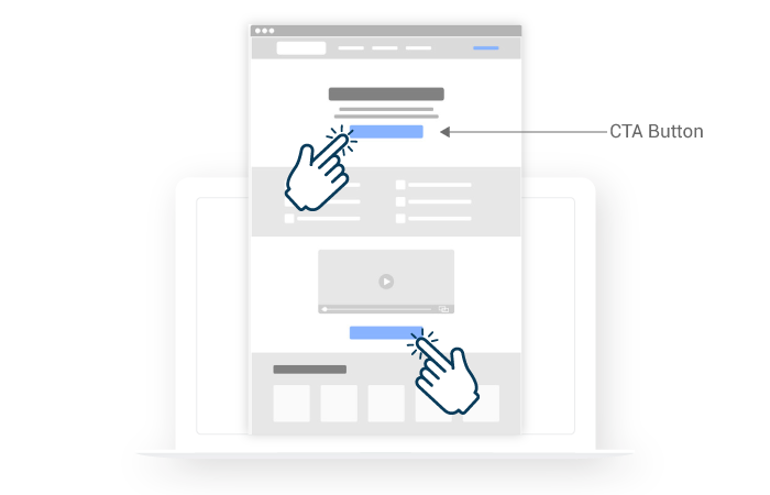
Position of a CTA directly impacts the visitors’ decision to click on it and perform a specific action. Placing the CTA above the fold is a prominent strategy many marketers adopt so visitors can see it right away.
To make your CTA button more clickable, you can present users with valuable information. Also, you can add customer feedback and ratings to compel them to click on the CTA button. Lastly, you can place the CTA button on the last part of the page after engaging users fully through an appealing video.
4. Make your CTA the focal point:

Your website CTA is the most prominent element of your website. Play with it and make it more colorful and vibrant so that it must not hide behind the other elements of your page.
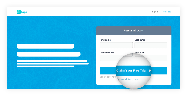
For example – The primary goal of your marketing campaign is to provide “free trial sign-ups ’’to your users. So, you must redirect the visitors’ attention to your primary goal that is your CTA. Otherwise, if your CTA looks like any other element. Your marketing campaign will certainly fail out.
5. Contextualize your landing page:
A CTA is not merely the heart of your website. What actually leads a user to your website is the wholesome experience a user gets from your landing page. Therefore you must optimize each and every element of your website and a well-created sync amongst them lets a user decide whether to click on the CTA button or not.
Therefore in order to increase the conversion rates, you must use an effective marketing model and that is AIDA. ( Attention, Interest, Desire and Action ). In AIDA, you usually lead visitors through a purchasing funnel. Therefore, you can use this method to create a visitor supportive landing page.
In the AIDA model, you provide feasible information about the product such as how is it solving user issues and assuring the visitors through social proof and evidence. Ultimately all this information leads users to your CTA button.
CONCLUSION
Apply the above-mentioned tactics and you are surely increase click through rates for CTAs.


 Email
Email SMS
SMS Whatsapp
 Web Push
 App Push
 Popups
 Channel A/B Testing
  Control groups Analysis
 Frequency Capping
 Funnel Analysis
 Cohort Analysis
 RFM Analysis
 Signup Forms
 Surveys
 NPS
NPS Landing pages personalization
  Website A/B Testing
  PWA/TWA
 Heatmaps
 Session Recording
 Wix
Wix Shopify
 Magento
 Woocommerce
 eCommerce D2C
  Mutual Funds
 Insurance
 Lending
  Recipes
  Product Updates
 App Marketplace
 Academy

