Marketing efforts involve cultivating relationships with the target audience. Whether it is about content, social media, search engines, or email marketing, your campaigns should aim to capture prospects and lure them to your brand.
Although all marketing essentials can be effective in finding potential clients, email marketing campaigns with thoughtful email signup forms possess a superior ability to reach the right prospects directly.
Yet, in order to turn your visitors into your subscribers through persuasive email newsletters, you need to make a great first impression. And this is where convincing email signup forms come in handy.
This article showcases how to create email signup forms and email subscription form best practices for you to compel prospects to submit their email addresses and open your newsletters. Additionally, there are some email sign-up form examples and templates to excite potential subscribers waiting for you as icing on the cake.
Contents
Best Practices for Email Signup Forms
Although there is a diversity of signup form templates online, it is crucial to comprehend the different types of signup forms and their primary goals before designing unique email signup solutions or choosing pre-made signup form templates to use on a business website.
For starters, there are three main types of email signup forms — embedded subscribe forms, popup email address signups, and landing page signup forms for collecting email addresses and expanding the list of email subscribers.
- Embedded email signup forms are versatile static forms you can place directly on your website pages. There is no limit to the number of forms you can utilize per page. So try to strike a balance between build-up and creativity to have more chances of capturing leads during page scrolling.
- Popup email newsletter forms are dynamic attention-grabbers that appear when users examine the page content. Popups are highly-visible and therefore provide better interaction with potential subscribers.
However, unlike embedded signup form design options, popup forms can seriously affect the UX. So fine-tune the display settings to ensure your popups are not annoying or intrusive to visitors.
- Landing page signup forms are separate site pages or one-page websites devoted to a single mission — collecting email addresses or numbers with SMS forms. The landing page signup form template usually aims to compel the prospect to subscribe to a single product or deal. The most important thing here is to make your landing page an inspiration, full of beautiful visuals that make visitors focus on the content.
How to Create Email Signup Forms that Bring Subscribers?
Different email signup form types require specific optimization practices. However, there are some essential email address collection forms and tips to consider, regardless of the signup type or purpose. Employing these practices will boost your opportunities to create email signup forms that actually convert and drive new leads.
1. Get Relevant Traffic to Your Website
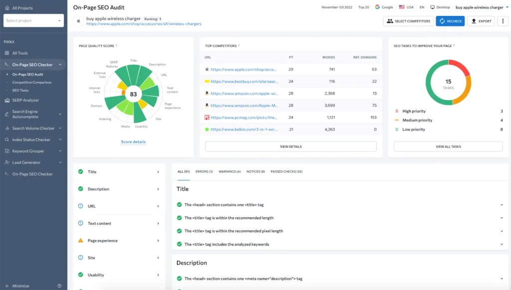
Placing an alluring email signup template with CTAs on a page with no traffic surely won’t bring the desired conversions. Consequently, if your site or blog pages lack relevant traffic, all your efforts to gain more subscribers will be in vain, no matter how exquisite and captivating your email signup forms look.
Furthermore, if your website boasts tons of regular page views, take the time to analyze this traffic to ensure you get organic visitors that fulfill their search intent on your website. Otherwise, you will be dealing with users who have no interest in the things you offer, and growing the newsletter list could become an uphill battle.
Thus, the quality of traffic is paramount to attracting users to your newsletter. By aligning your content with your target audience’s specific needs and expectations, you can ensure that visitors who arrive at your site will be more likely to fill out a form or sign up for a newsletter.
To receive evergreen traffic, you need to enhance your website pages and make them look and feel well-structured and informative for users and search engines.
The AI-powered On-Page SEO Checker from SE Ranking allows you to conduct a comprehensive SEO page analysis with a data-driven roadmap.
It automatically scans your pages to meet essential on-page SEO factors related to metadata, text content, user experience, etc. The tool also compares pages to top-performing competitors to give you insights for further refinements.
2. Choose a Signup Form or Popup Design
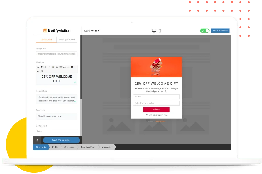
Each website page is a sheet that requires creativity and precise attention to detail. Therefore, the look and placement of your email signup form matter a lot and are even game-changing. Thus, you need to decide on the right signup form template and determine where to allocate the newsletter form to get the most out of it.
First and foremost, opt for marketing automation software to design your lead forms. The tool of your choice should have flexible settings and an exhaustive set of customization options, so give preference to DIY popup and signup form builders.
Moreover, a collection of pre-designed subscription form templates that require only some personalization is a huge plus. However, you can always switch to custom-made forms that meet your business needs.
When it comes to how to create email signup forms, it is quite a straightforward process. Go to the dashboard of the selected subscription form builder, select the type and layout of the signup form you want to design, refine the text and visuals, adjust the functionality, and add the form to your website.
3. Make Your Value Proposition Clear
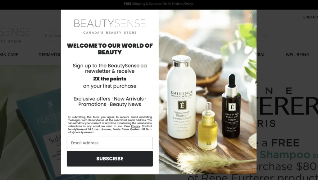
The most efficient newsletters are those with simple, clean, and captivating signup forms or email popups that bring value to potential subscribers. Therefore, your primary mission is to create email signup forms that clearly showcase your advantages to visitors who are about to join your email list.
Make sure your message is clear, and do not forget to highlight the benefits users can obtain from sharing their email addresses. For example, the beauty store below offers visitors double points on the first purchase as well as promises access to exclusive deals, promotions, beauty news, and more.
4. Minimize the Number of Fields You Use
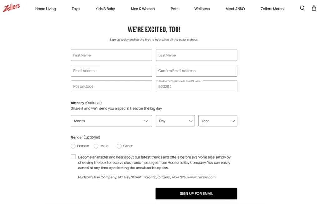
Indeed, businesses want to receive as much data about a prospect as possible. It helps to adjust the target in the future and better understand the buyer’s persona. However, everlasting form fields to fill in are reminiscent of that boring, pesky documentation that everyone always wants to skip. And it directly affects the conversion rate.
So, try to make your email signup forms clear and concise. If you still want to receive more information from potential subscribers, make some fields optional so that users can omit them seamlessly and don’t feel pressured.
5. Make your Email Signup Form Visible

The placement of your subscription form is the lion’s share of success. If you design your form accurately but then arrange it wrong, users won’t be able to take the target action due to the poor visibility of the signup form.
Moreover, if you make the popup newsletter too pushy and repetitive, potential subscribers will skip the subscription or leave the website, which is even worse. Therefore, knowing where to place your email newsletter is key, and it certainly depends on the type of form you decide to add to your site.
For example, embedded email sign up form examples can be placed within the body of the page and in the website sidebar or footer. Feel free to add the newsletter to multiple pages or enrich your signup form with a catchy promo related to the page content to make it work even better.
Regarding popups, consider your homepage as the first place to add your newsletter. The Website homepage usually gets the most page views, and therefore it is an excellent opportunity to boost your conversions.
Arranging popup subscription forms on other pages with high traffic is also an option. Hence, conduct an in-depth site analysis regularly to monitor page efficiency and adjust your signup forms.
6. Encourage Users to Make a Step
Marketing rules the world these days, establishing high-end practices for capturing leads and increasing conversions. So, you should stay up-to-date with these tendencies and be ready to go the extra mile for your visitors, bringing them additional value and care.
Regarding email signup forms, think of perks you can offer potential subscribers for choosing you among other newsletter options. You could consider adding a promo code, a first-purchase discount, a free niche-related guide, or any other gift that can compel your prospects to add their email addresses and subscribe to your branded newsletter.
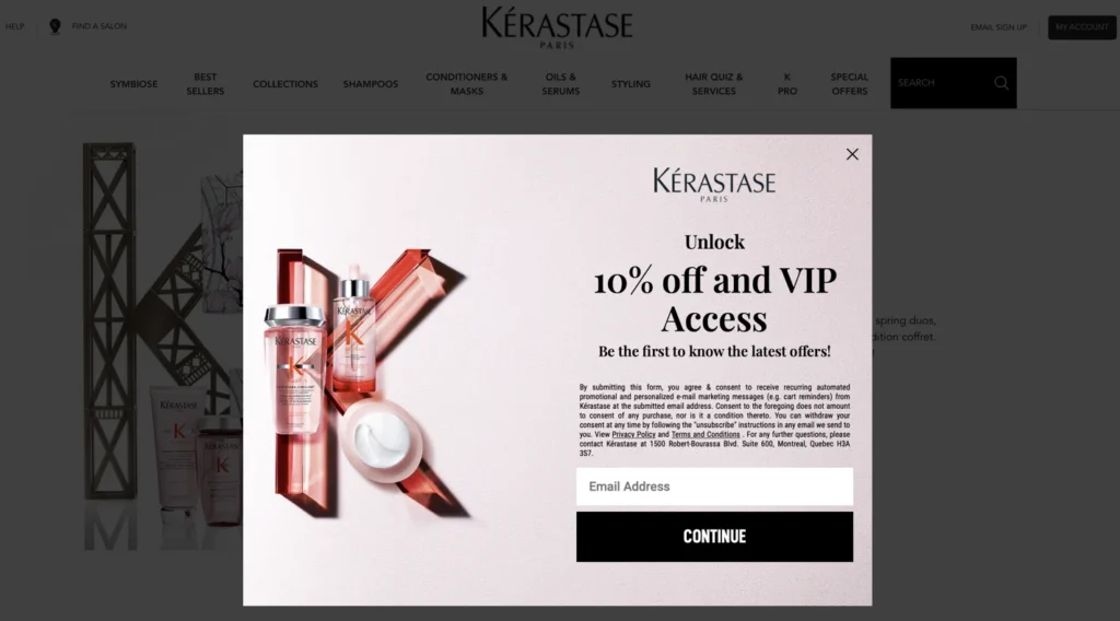
To illustrate, the haircare brand Kerastase offers potential subscribers exclusive access to new products and offers, personalised hair care recommendations, and coveted stylist tips to be in the know, topping it all off with a 10% discount on the first purchase.
Also, to encourage users to make a target action, make sure your signup form has a clear call-to-action, as visitors often can’t get to the next step due to information overload or poor subscription form design. Therefore, ensure your message is friendly and polite yet communicate persuasively.
Additionally, consider employing limited-time offers highlighted with countdown timers to boost conversions. Generally speaking, countdown timers drive motivation, which can lead to more conscious and curious newsletter subscriptions.
Enhancing your site pages with a proper email signup form displaying a time-dependent deal will increase your chances of attracting more newsletter subscribers.
7. Showcase Social Proof
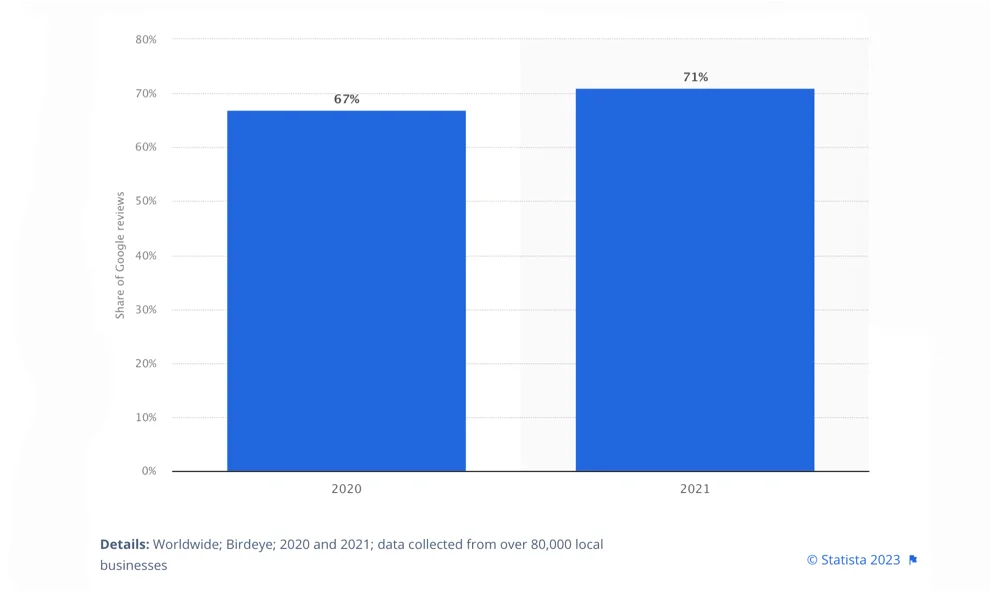
Statista presented a share of consumer reviews posted on Google worldwide in 2020 and 2021. The report showed that Google received over 70% of consumer reviews in 2021.
This example demonstrates customers’ desire to communicate their shopping experiences and widespread opinions, making social proof a mighty tool that dramatically affects businesses of any size or niche. That is why it is so essential to have relevant customer reviews for brand awareness and growth.
Adding social proof to your email signup forms is an excellent way to achieve your goals related to newsletter subscriptions. If a full-featured slider of testimonials is too much for the size of your email signup form, consider showing social proof by emphasizing the number of subscribers you have already acquired. The Webdesigner Depot blog is a good example of such a practice.
5 Email Signup Form Templates with Examples
Let’s take a look at five engaging email sign up form examples and highlight their nuances. Perhaps you will choose one of them as a newsletter subscription form template for your business website.
1. Clean Inline Email Subscription Form
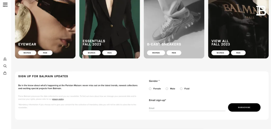
Balmain’s website boasts a minimalist embedded email newsletter that perfectly matches the overall look and feel of the site. Such a solution suits different industries, not only fashion and beauty sites, as the form is versatile and non-intrusive.
The newsletter form allows potential subscribers to stay in the know about bonuses they can get when submitting their email addresses. This signup form is not overloaded with fields and asks you to select a gender from the suggested options and type your email.
2. Popup Email Newsletter with Perks
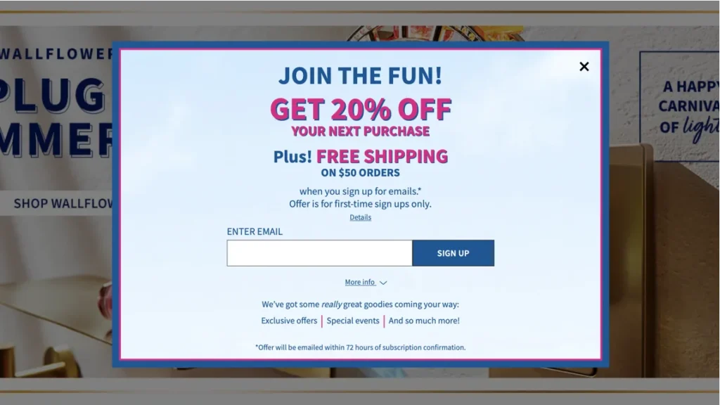
Another email signup template is from Bath & Body Works. This popup email signup form has central alignment and appears just a few seconds after entering the homepage. Moreover, the form blurs other page content behind the popup to grab visitors’ attention.
It looks clean and pleasant and offers the prospect extras to proceed with the subscription. Thus, subscribers can get free shipping and 20% off the next purchase in addition to exclusive offers and news about special company events. It illustrates an excellent example of value communication.
3. Minimalist Email Signup Form with Preferences Selection
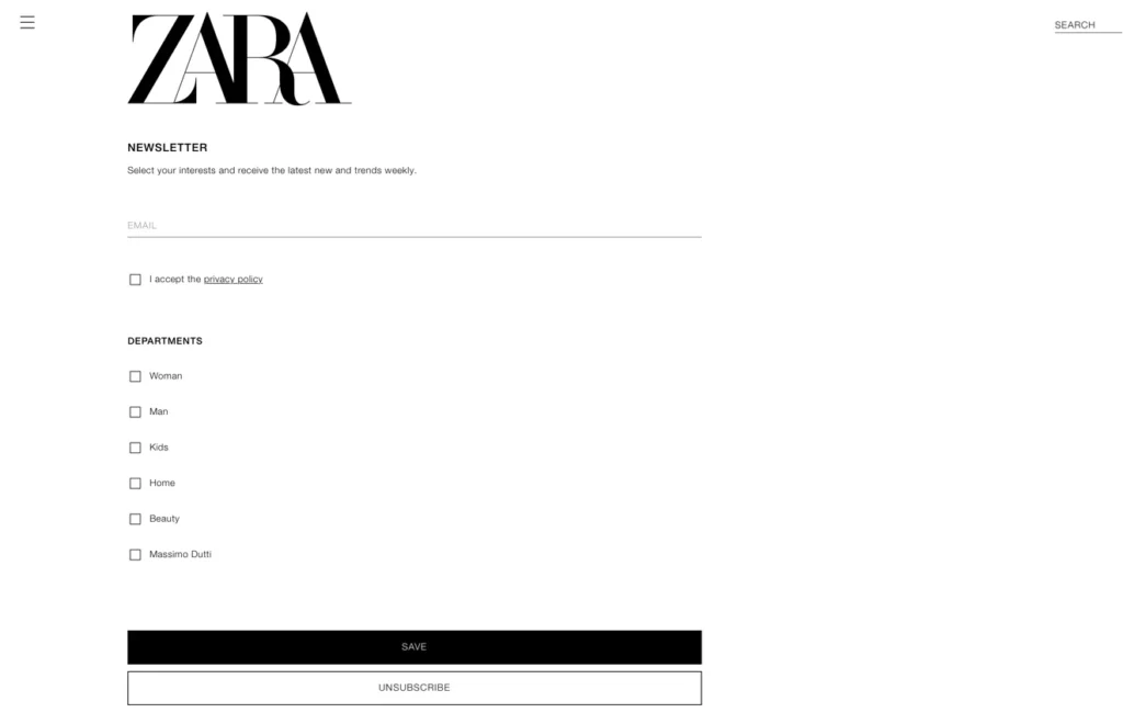
Allowing your potential consumers to receive branded emails according to their preferences and interests is a superb option to reach your goals. Moreover, if you run several newsletters, providing a choice to subscribers is a must to help them avoid bothersome letters with no value.
Zara’s website delivers an engrossing email subscription form that looks like a full-screen popup. It has a list of departments to choose from so prospects may select their interests and receive relevant offers and company updates.
4. Slide-in Email Newsletter Popup Form
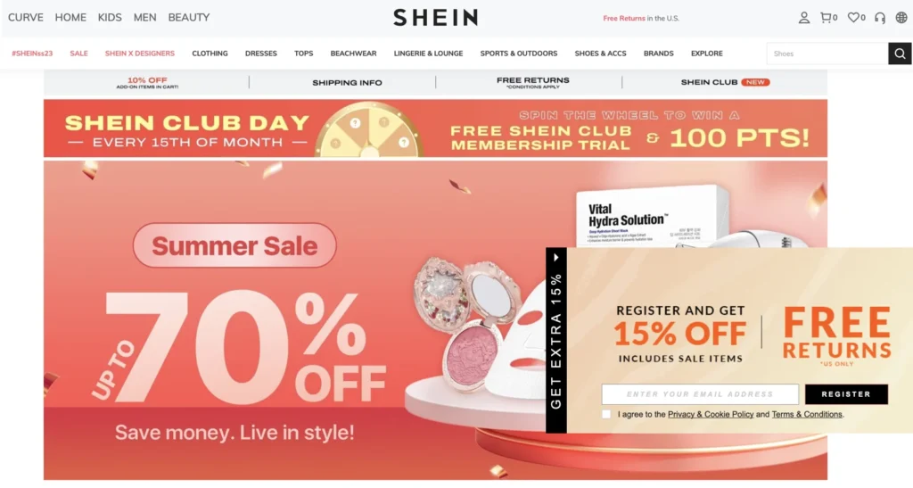
Shein’s website represents another example of a captivating email signup form template. It is a slide-in or scroll box popup form. Even though this subscription form can be skipped as it doesn’t conceal the page body content, it is still an accurate option that avoids interrupting users.
This form also showcases the benefits visitors can get after subscribing and can therefore be your helper on the way to high-end conversions.
5. Interactive Email Signup Form

Personalization is key as it helps you to stand out and touch visitors, eliciting a dialogue. An interactive email subscription form can also become a conversational tool that can help you.
The embedded newsletter collection form on the IL Makiage website perfectly represents this personal feel, accurately delivered to the audience. The signup form also provides information on extras users can obtain by confirming their subscription.
Wrapping Up
A variety of marketing objectives, together with creativity, create a space to unwind and allow for the design of stunning email subscription forms. But, evidently, there is no precise manual with a checklist to follow to create email signup forms at a glance that will fully convert visitors.
You should test your forms regardless of their type and design and choose whatever works best for you and your target audience. Just try to keep it straightforward and centered on the subscriber. We hope you find this how to create email signup forms guide useful.


 Email
Email SMS
SMS Whatsapp
 Web Push
 App Push
 Popups
 Channel A/B Testing
  Control groups Analysis
 Frequency Capping
 Funnel Analysis
 Cohort Analysis
 RFM Analysis
 Signup Forms
 Surveys
 NPS
NPS Landing pages personalization
  Website A/B Testing
  PWA/TWA
 Heatmaps
 Session Recording
 Wix
Wix Shopify
 Magento
 Woocommerce
 eCommerce D2C
  Mutual Funds
 Insurance
 Lending
  Recipes
  Product Updates
 App Marketplace
 Academy

