What is a landing page? Well, It is a web page that people arrive on after clicking an advertisement or call-to-action button for an offer. Businesses create it to convert visitors into prospects.
A landing page can help you generate leads by encouraging visitors to take action, such as filing out a custom signup form or making a purchase. It turns out pretty useful when you need to push visitors toward the sales funnel.
How is it different from a website? The answer is its one and only motive – customer acquisition. A website serves multiple purposes, including consistent branding, a complete overview of your business, intuitive navigation, and many more.
At the same time, landing pages are only designed for a specific campaign or offer. Now, the question you might be thinking is ‘how to create a landing page.’ That’s what we are going to discuss with you through this post, that too step by step.
But first…
Contents
Why should you use a landing page?
A landing page focuses on fulfilling certain short-term goals that can get you the results you desire, and this makes it one of the most effective marketing tools. From gathering valuable information about visitors to improving the performance of paid marketing campaigns, landing pages can help you in a number of ways. Some of them are:
1. Build Credibility
A landing page contains a direct and to-the-point message that explains to visitors what you’re offering them and how it can actually help them. This way, you show them that you respect their time and care about their interests. Displaying customer testimonials about your product or service can further help you boost the credibility of your brand.
2. Make a great first impression

The first impression has to be great, especially if you’re new in the business, and a landing page can help you ensure that. Engaging and effective landing pages that deliver value to the visitors and offer them CTA choices can give a boost to the initial customer journey.
3. Generate new leads for your business
Landing pages are well known for creating leads and increasing sales for businesses. They are highly targeted and segmented, which allows them to give a major push toward increasing conversations.
How to create a landing page?

Now that you know what a landing page is and what its benefits are, it’s time to look at how to create one for your business. This may sound easy, but it can be complicated for many, as creating and designing an effective landing page requires you to put all the critical elements perfectly in the right places. But there is no need to worry because we’ve got you covered. All you need to do is go through the below steps one by one:
Step 1: Find a reliable landing page builder software
If you don’t know much about coding, then creating a landing page on your own can be quite difficult. Therefore, using good landing page builder software would be best for you.
We recommend you NotifyVisitors, which can help you create and customize landing pages quickly without the need for coding. We offer templates that suit the requirements of your business.
As it comes with a drag-and-drop system, using it to add different layouts and designs will be a cup of tea for you. On top of all these, it can also analyze the performance of your landing pages and suggest ideas to make them better.
Step 2: Know your goals
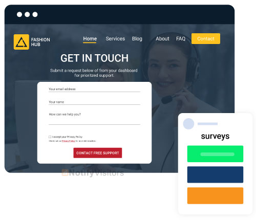
Before you dive into the world of templates to select one, it’s good if you identify what you expect from your landing page. To create a great landing page, you need to give it a clear and measurable agenda to attain.
This way, you get an idea of the type of template you should select for your landing page, how its copy needs to be written, and which elements are to be the best to add to it.
There are many objectives that a landing page can fulfill:
- Gather information through forms.
- Conduct surveys.
- Increase the number of journal subscribers.
- Encourage visitors to get registered for events like a webinar.
- Get visitors to make purchases.
- Promote new products and services.
- Provide information through free eBooks.
You have to choose a specific conversion goal for your landing page. It can be anything from persuading visitors to purchase to download free eBooks. There are two reasons we’re saying this. First, it will not only make your landing page easier to create but also highly targeted. Second, the fewer options you give to the visitors, the better decisions they make.
Step 3: Choose a template for your landing page
After identifying the conversion goal for your landing page, the next step is to choose a template for it accordingly. What we are trying to say is some landing page templates give better results for certain conversion goals than others.
For example, if you want visitors to buy your product, you may consider keeping the call to action of your landing page pretty straightforward. Whereas, if you want them to sign up for a webinar, you may need their personal details like name, email address, etc., which can make your call to action a bit more complex.
Usually, all landing page builder software offers a variety of templates based on multiple categories that save you both effort and time. This means all you need to do is select one that matches your requirements.
Step 4: Give your landing page a heading
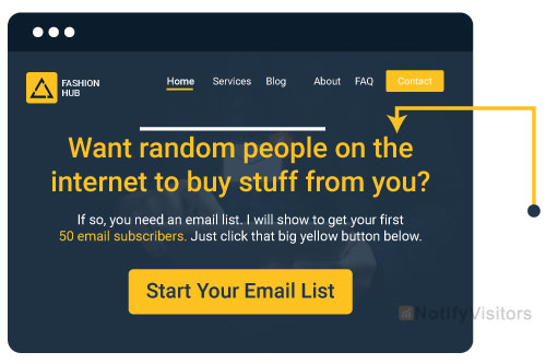
The headline is the element that will appear at the top of your landing page, and you have to make sure it is appealing enough to make visitors curious about your offer.
On average, a visitor likes to spend a few seconds on a heading, which means it should be both concise and easy to understand. One more important thing you have to be careful about is that the heading should resonate with the message of the advertisement that brings visitors to your landing page.
Step 5: Explain your offer
If your offer is pretty simple, then adding one or two subheadings alongside the heading may be enough for visitors to understand it. However, in other cases, the problem-solution approach will be a better choice. Because this way, you will be able to emphasize how your offer can resolve their problems and make their lives easier.
You are required to convey to them the benefits they can get by using your product. Here, rather than making a statement about your brand, you need to focus on presenting your product in a way that boosts the visitors’ mood.
Ensure that your sentences are short and to the point. Avoid putting any unnecessary details and business jargon phrases that can annoy the visitors or shift their focus.
Step 6: Include creative visual content
After explaining your offer in words, now’s the time to use some creative visual content to make your landing page look more professional. From the images of your product to animated GIFs, it’s up to you to figure out what presents your product in a more appealing way to the visitors.
Wondering if all this is even necessary? Well, the answer is ‘Yes .’Visual content is both easy and quick to understand. It makes your offer clearer to the visitors and plays a positive role in their decision-making. By using strong imagery, you can attract the attention of visitors and move them to take action. In simple words, it can lead to higher conversions.
The followings are some advice we would like to consider while choosing your visual content:
- Your main banner should look unique and professional because it directly appeals to the visitors and makes them understand what your offer is all about.
- It’s better if you prefer real images and videos over animated ones, especially when you’re thinking of including visuals of people using your product. This helps you connect with the visitors on a more personal and emotional level.
- Use visuals that better convey the features and benefits of your product. This way, you can save yourselves from the efforts of explaining them in words.
Step 7: Design an appealing call-to-action
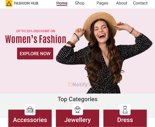
Here comes the time to design the most important element of your landing page – a call to action. It can be in different forms like “See Pricing,” “Start your free trial,” a contact form, and many more. Generally, businesses prefer to keep CTAs simple and large in size to make them stand out.
One thing that makes a CTA effective is that it should clearly convey to the visitors their next immediate steps. Therefore, you must ensure that there aren’t multiple calls on your landing that can leave the shoppers confused or distracted. Keep your goals clear, which means figuring out what you want your visitors to do on a prior basis.
Do you want them to download an eBook or register for some event? Answers to such questions can help you design the CTA in the right way.
Tip: The use of a combination of contrasting colors to design CTAs often gives better results.
Step 8: Attach social proof

The growth of your online business depends on your brand’s reputation, especially when you’re trying to deal with people who know nothing much about it. In fact, if we go by the studies, more than 90% of customers choose online brands on the basis of reviews they find online as much as personal recommendations.
Therefore, it would be smart on your part to use feedback and testimonials from your loyal customers as social proof to prove the credibility of your brand. This can help you encourage your landing page’s visitors to give your products or services a try.
There are numerous types of social proof you can add to your landing page, like testimonials, case studies, customer ratings & reviews, the number of subscribers, etc.
The best practice is to put your social proof next to the call-to-action button, as this is the area where you would like to give some extra push. One more piece of advice for you is to try to keep them short. You can use different fonts to make it stand out from the rest of your landing page.
Best examples of landing page
Now that you know how to create a landing page for your business, we would like to discuss with you some of the best landing pages alongside the reasons why they turn out so effective & successful.
1. Zillow
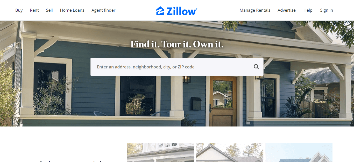
Zillow, a tech real-estate marketplace company, has done an incredible job creating this landing page. What makes it interesting is that it gives visitors the feeling of a game, where they need to fill in an address and take a guess on how many homes in that area are worth. Then it will tell them how close they are to the correct answer.
Why is this landing page successful?
- The first reason is pretty obvious – it’s unique and fun.
- The second reason is the way Zillow used its network to establish its dominance on the subject – ‘Real estate.’ With access to so much data at hand, there’s no doubt left how it has become one of the top home search websites.
2. Next Bee
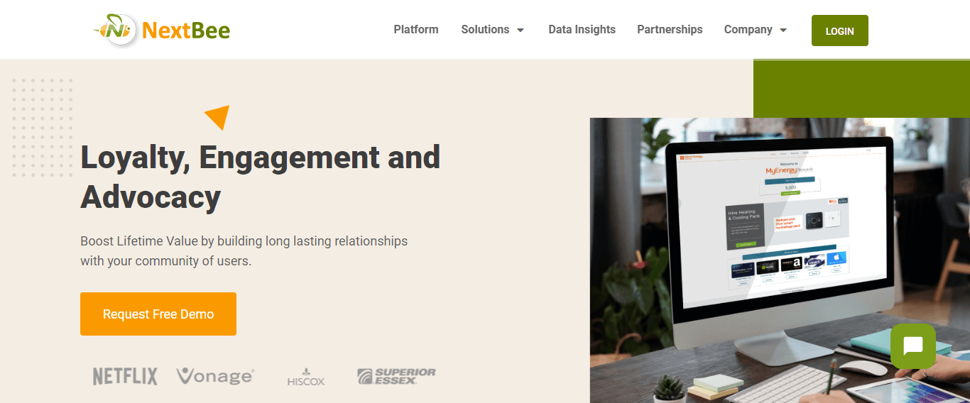
If you have a lot of things to share on your landing page, then you surely should consider the design of this Next Bee’s landing page.
Why is this landing page successful?
- The very first reason is the relevant headline that talks about the benefit that people are supposed to get from this product.
- It promises to be the best of all, and to prove this; it’s offering a reward if anyone shows a better quote or deal. This shows the high confidence that the company has in its product.
- Another reason is its neatly organized content. It contains only short and valuable sentences, due to which it easily manages to describe fourteen features of the product.
3. Talkspace
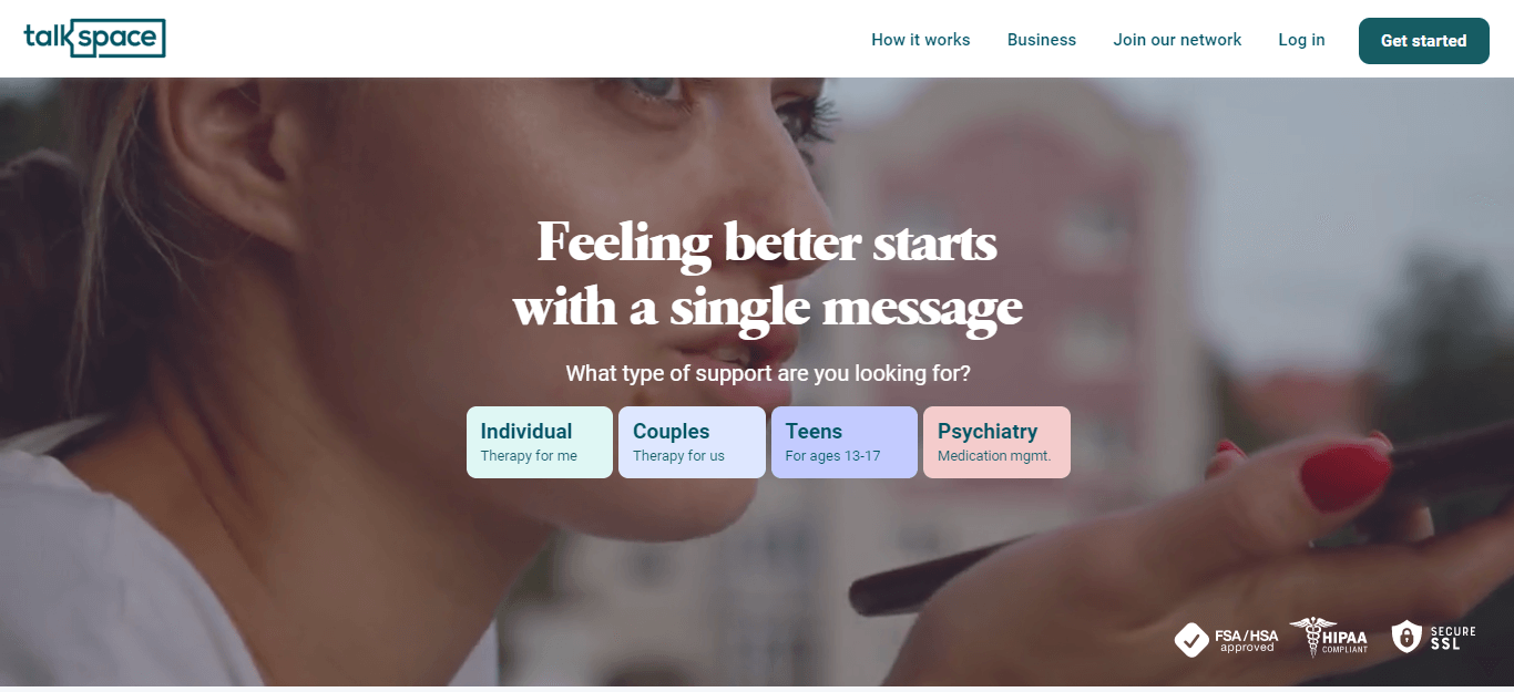
The above landing page of Talkspace is one of the perfect examples that show how a brand can build credibility. It talks about how people can get in touch with licensed therapists to overcome the hurdles they are facing in their lives.
Why is this landing page successful?
- The first reason is the way it reassures people who may be uncertain whether to enroll in such services.
- Another reason is its simplicity. There is nothing unnecessary or, we say, any kind of distractions on this landing page, which matches the company’s goal – removing distractions from the lives of its patients.
- It also gives value to its visitors by providing them with useful resources and articles on mental health.
Conclusion
We hope this post helps you understand how to create a landing page and the basics of creating one for your online business; further, we have also shared some of the best landing page examples for your reference. If you want to create exceptional landing pages and optimize them, schedule a free demo with us to get started.
FAQs
1. What is the purpose of a landing page?
A landing page is used by eCommerce businesses for lead generation. It helps them persuade visitors to take action, such as subscribing to the email list, filling in a contact form, or making a purchase.
2. What are the benefits of a landing page?
Ecommerce businesses can avail themselves of a number of benefits by creating a landing page. It helps them leave a good first impression, build brand credibility, promote new products, increase reach, and generate new leads.
3. What should you add to your landing page to get good results?
To create an effective landing page to make the most out of it, you must consider including the below-mentioned elements to it:
1. A simple and direct headline.
2. Creative visual content.
3. An appealing call-to-action button.
4. Social proof (customer reviews and testimonials).


 Email
Email SMS
SMS Whatsapp
 Web Push
 App Push
 Popups
 Channel A/B Testing
  Control groups Analysis
 Frequency Capping
 Funnel Analysis
 Cohort Analysis
 RFM Analysis
 Signup Forms
 Surveys
 NPS
NPS Landing pages personalization
  Website A/B Testing
  PWA/TWA
 Heatmaps
 Session Recording
 Wix
Wix Shopify
 Magento
 Woocommerce
 eCommerce D2C
  Mutual Funds
 Insurance
 Lending
  Recipes
  Product Updates
 App Marketplace
 Academy

