The email users worldwide is expected to cross 4.3 billion.
All of these users are members of your target audience, which are quality leads and prospects that you can work to reach and convert through email.
The design of your email needs to be right to ensure that your emails stand out and capture that audience’s attention.
This guide will discuss what email design is and cover the best practices and examples of successful design.
Contents
What Do You Understand About Email Design?
It refers to creating compelling email elements that are relevant to your email marketing efforts and helps increase the ROI of your email marketing efforts.
For example, when working on interior design, a designer considers the room’s layout, dimensions, color schemes, interior decor and furniture, and other elements. Similarly, when designing an email, one must consider various aspects before starting the design process.
What are the key features of email designs?
The key features of email designs include the following:
1. Copy:
- Clear, concise, and compelling: Get straight to the point, use active voice, and avoid jargon.
- Benefit-oriented: Focus on the value proposition and how your message benefits the reader.
- Personalized: Use subscriber names, purchase history, or interests to personalize the content.
- Scannable: Break up text with bullet points, short paragraphs, and white space for easy reading.
- Proofread meticulously: Ensure error-free communication to maintain professionalism.
2. Structure:
- Logical and easy to follow: Guide the reader’s eye through the content with a clear information hierarchy.
- Mobile-friendly: Design for optimal viewing on all devices, prioritizing a single-column smartphone layout.
- Inverted pyramid approach: Place the most critical information at the beginning of the email to capture attention.
3. Headings:
- Clear and attention-grabbing: Use concise headlines that accurately reflect the content below.
- Hierarchy and consistency: Use different sizes and styles to create a visual hierarchy and guide the reader.
- Actionable: Consider using headings to prompt an action, like clicking a link or visiting a page.
4. Links:
- Clear and descriptive: Use text that accurately conveys where the link leads instead of generic phrases like “click here.”
- Visually distinct: Underline, bold, or use a different colour to make links stand out.
- Trackable: Utilize URL shortening services to track clicks and analyze user behaviour.
5. Calls to Action (CTAs):
- Prominent and clear: Use strong verbs like “Shop Now,” “Learn More,” or “Download” to tell users what to do next.
- Contrasted visually: Use contrasting colours or buttons to make your CTAs visually distinct from the surrounding content.
- Limited and specific: Include only one or two primary CTAs to avoid overwhelming the reader.
6. Visuals:
- High-quality and relevant: Use professional-looking images, aesthetic photography, videos, or GIFs that complement your message and brand. You can create your own videos using a powerful screen recorder especially if you share illustrative content, and even convert such videos into GIFs, and images to add more value to your emails.
- Optimized for size and loading speed: Ensure images are optimized for email and load quickly to avoid impacting user experience.
- Balanced and strategically placed: Use visuals sparingly and strategically to break up the text, enhance the overall design, and not overshadow the content.
7. Color:
- Brand consistency: Use colours that align with your brand identity for recognition and consistency.
- Purposeful and balanced: Choose colours that evoke specific emotions and create a visual hierarchy within your email.
- Accessibility-conscious: Ensure adequate colour contrast between text and background for better readability, especially for individuals with visual impairments.
8. Typography:
- Brand-consistent and professional: Use fonts that reflect your brand personality and are readable on various devices.
- Limited font variations: Stick to a maximum of two or three fonts to maintain a clean and professional look.
- Appropriate size and hierarchy: Use larger fonts for headings and smaller fonts for body text, creating a clear hierarchy and visual flow.
9. Brand Identity:
- Consistent visual representation: Maintain constant use of logos, colours, fonts, and imagery across all your emails to reinforce brand recognition.
- Voice and tone: Ensure your copy reflects your brand voice and tone, whether informative, friendly, playful, or formal.
- Overall experience: Create a cohesive email experience that aligns with your brand image and resonates with your target audience.
By focusing on these critical features, you can design emails that are visually appealing and effective in achieving your marketing goals.
Why Does Designing an Email Matter?
We live in a world that is now loaded with information. No matter how connected your brand is, you can’t expect your audience to read everything. People don’t have time for that. They scan, not read.
You still need to provide information. Add to that the short attention span of most adults and short text isn’t enough to do the job. It is where custom email designs come in.
You can play with the flow of reading and create a way to give your audience information to help your campaigns succeed.
However, the possible reasons why email design matters are as follows:
- It helps to support the brand identity.
- It helps in engaging the audience with your brand.
- It resonates with the target group.
- It helps to capture the viewer’s attention.
- It can have a long-lasting impact on the reader.
What are 5 Email design trends?
Here are five key email design trends to consider:
- Interactive Elements: Gamified elements, polls, quizzes, and carousels can increase engagement and make emails more interactive and dynamic.
- Dark Mode Compatibility: With the growing popularity of dark mode interfaces, designing emails compatible with dark themes ensures optimal readability and user experience.
- Accessibility and Inclusivity: Prioritize accessibility using proper colour contrast, clear and concise language, alt text for images, and responsive design for various devices and abilities.
- Monochromatic and Duotone Color Schemes: Simple and elegant, these colour schemes offer an uncluttered and modern aesthetic while emphasizing specific elements within the email.
- Storytelling with Visuals: Leverage compelling imagery, illustrations, and animations to visually engage your audience and effectively convey your message.
Types of Email Design
1. Plain Text
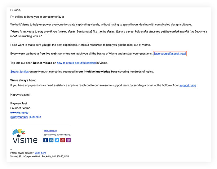
A plain email needs no introduction. Its structure is simple. This type of email is usually used for personal correspondence. The advantages of using it are:
- It’s personalized
- It contains only basic information
- Responsive and mobile friendly
- It’s easy to design
However, it lacks the wow factor. No spectacular hero scenes or interactions set it apart from the crowd. It’s plain and boring.
2. Rich HTML design
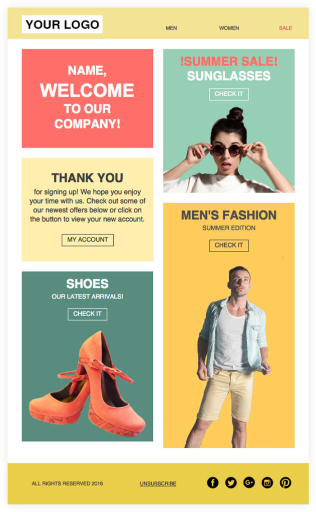
A rich HTML email is like a mini landing page. It has a unique design, graphics, colour, beautiful prints, and different products. They are created with HTML and CSS. The main advantages of this type are:
- Impressive
- Flexible
- It has all kinds of content like images, animated gifs, etc
- Well organized
However, depending on the screen size, your style may distort. You also need creativity and coding skills to pull it off.
3. Interactive email templates
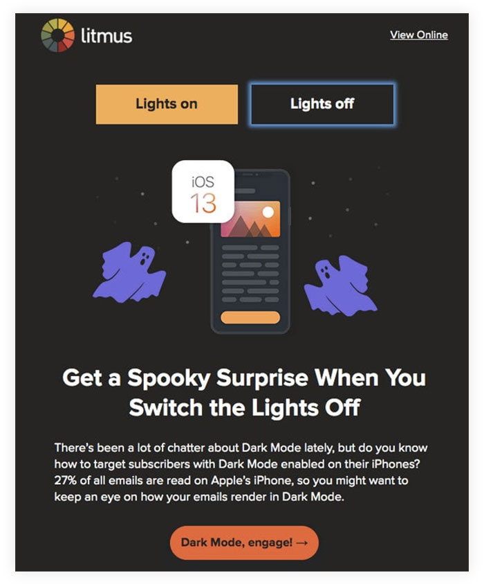
It refers to using JavaScript-based communication facts. They are very interesting and exciting. Unlike other genres, it has an impressive wow factor that will win over any crowd. In addition to AMP emails, it dares to be our new future.
However, there is an important obstacle that cannot be overcome. Currently, most email readers do not support JavaScript.
So, you only leave a small portion of the market to enjoy. The same goes for AMP. Although the system is robust and reliable, it is not yet accepted by all email readers.
Let us now understand the best practices to follow while designing an email.
Best Practices to follow while designing an email
1. Create a strong headline
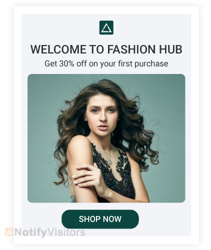
Your email subject line is the first thing someone sees when you send them an email. It’s a clear statement that should pique your host’s interest. It needs to grab their attention, so they want to open your email and continue reading.
A headline will have the following features:
- Write down your readers’ thoughts in as few words as possible
- Give the value to the recipient who wants to open the email.
- Include what recipients will read and see after opening the email.
2. Write an interesting pre-header
Your email introduction is the introduction to what the email is about, just like the meta description of a website. It’s the second thing recipients see.
Instead of rewriting the first sentence of your email, you can edit the pre-header to give you an inside look at what your email recipients will read in your message.
3. Get to the point
Please give your email recipients the information they want and need from you without wading through the weeds. It shows them that you value their time and can help improve email subscriber retention.
4. Keep your email on brand
When email recipients open your message, they should know it is from your company. It means that your brand name should be displayed.
To keep your email on brand, consider using the following strategies:
- Use audio in your emails that complement your other content and marketing tools.
- Include the same colors and fonts in your online and marketing materials.
- Include your logo, your website link, your social media accounts, and an appropriate call to action (CTA) for your products or services.
5. Use design to improve your email user experience
No one wants to read random, unstructured emails. This can overwhelm recipients and increase rejection. Instead, organize your design with user experience in mind, which means ditching the white space and putting your written and visual content into an organized, intuitive, and easy-to-navigate format.
6. Personalize all emails
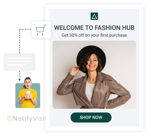
Personalizing an email and tailoring it to the recipient will be more thoughtful, professional, and personal. This key helps build relationships with your company and email recipients and increases email retention rates. Email personalization also helps to humanize your brand.
7. Include unique visuals
If recipients open an email and only see paragraphs of information, it’s hard to capture their attention and engage them with your message. Instead, include images, videos, GIFs, animations, and more. To eliminate scripted content and create an unforgettable experience.
8. Use emojis
At first, emojis can seem unnecessary or inefficient in an email. While this is a reasonable assumption, it is not true in some situations.
Adding emojis to your email subject lines and the copy can increase your open and conversion rates. But remember: if you’re using emoticons for marketing, make sure you know the meaning and implications of the ones you include.
9. Use the right strategy
Being responsive means your email is updated wherever you view it, whether on a desktop, laptop or mobile device.
Your email recipients can easily read your emails no matter where and how they view them. You can improve user productivity and manage email across all devices by incorporating responsive design.
10. Streamline your emails with CTAs
Call-to-calls (CTAs) are used to convert your email addresses. CTAs should be amazing and compelling and clearly state why they are worth clicking.
Additionally, you can tailor your CTAs to specific audiences. You can always increase click through rate by using various strategies.
11. Add the “Unsubscribe” button
Email marketing is most effective when you provide relevant content to your recipients. The sad but true reality of email marketing is that your recipients and customers change over time, especially as your business grows and changes.
Your content may not always be relevant to some audiences. To do this, make their lives easier with an easy-to-use and intuitive “Unsubscribe” button.
12. A/B testing or Split Testing
Like most marketing efforts, email planning is an iterative process. You can make changes and tweaks to get the most out of your design.
Whether you change your CTA, colors, images, layout, or tone, don’t be afraid to A/B test the design to ensure it’s the best, most artistically relevant, excellent, and transformative design.
13. Create an email signature
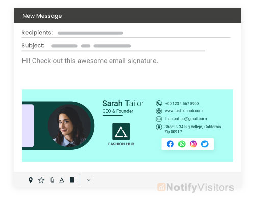
A good email signature means you can establish a professional and personal feel for the email. An email signature doesn’t have to be just your name — it should have a description and other memorable details about you, your job, contact information and business.
You can include some specific elements in your email signature:
- Name
- Address
- Job Title
- Company Name
- Social media
Email Design Examples
1. NotifyVisitors Marketing Blog

NotifyVisitors sends Marketing Blog emails to its subscribers regularly. The emails are branded to make an understanding to the reader who is sending those emails.
It may include a few articles on its website through which customers may learn about their services.
2. Collaborative Fund

While many companies use a large block of color at the top of their newsletters to draw people in, the folks at Collaborative Funds have gone one step further by adding red and yellow in every email.
In the design, red and yellow are strong colors. While red represents strength or passion, yellow is generally considered bright and lively.
Along with color, they used clean sections to separate these blocks while incorporating different textures, like that crumpled paper, to create a truly immersive experience.
3. Under Armor

Under Armour’s welcome email works because the marketing team chose images and text related to their product. Under Armor is the first thing you see in the design.
The colours in the images are consistent and make the email stand out. Also, the live email interface makes it enjoyable.
4. Starbucks Rewards
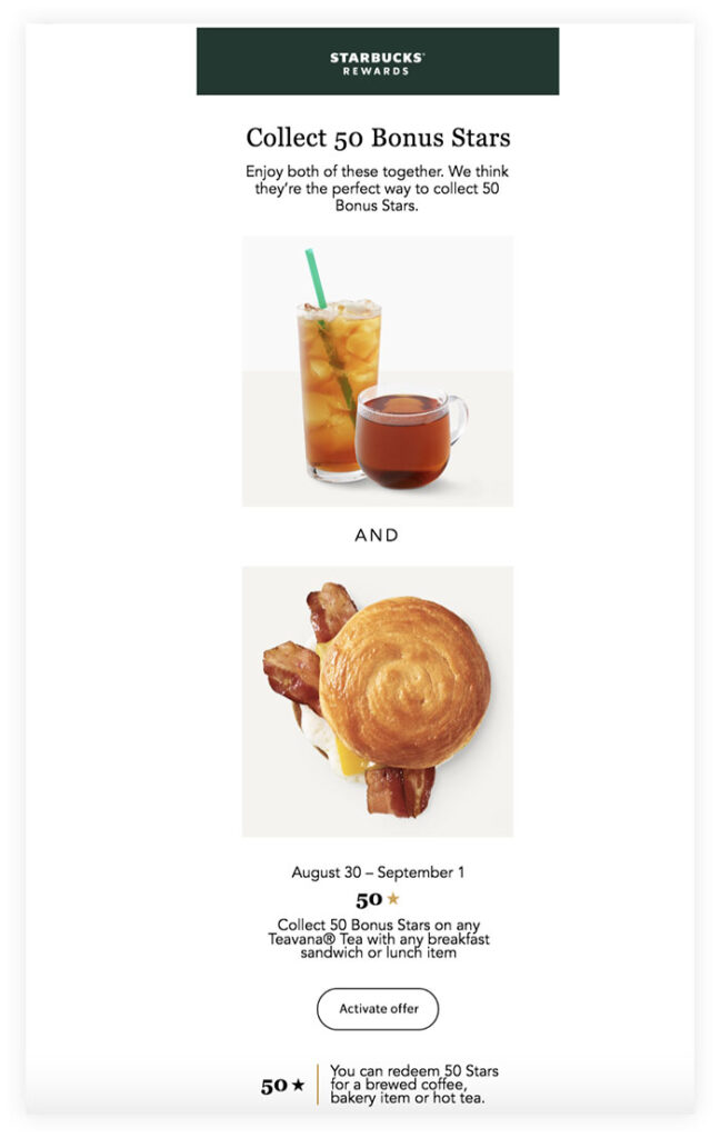
Starbucks customers and members may have seen this email or something similar in their inbox before:
Email complements Starbucks’ marketing and branding and has plenty of white space that separates written information from eye-catching images. The CTA is also clearly embedded, which buyers can click to activate the offer.
5. Peloton
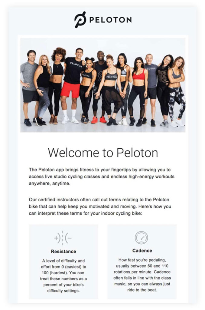
Peloton begins its email with an image that conveys a sense of community. Peloton’s welcome message includes several text sections but doesn’t look cluttered because they use white space effectively.
We also love it because it uses symbols to draw the reader’s attention to the “stride” and “cadence” sections.
The email explains what the Peloton app does and teaches the reader how to use it.
6. Vital Proteins email design
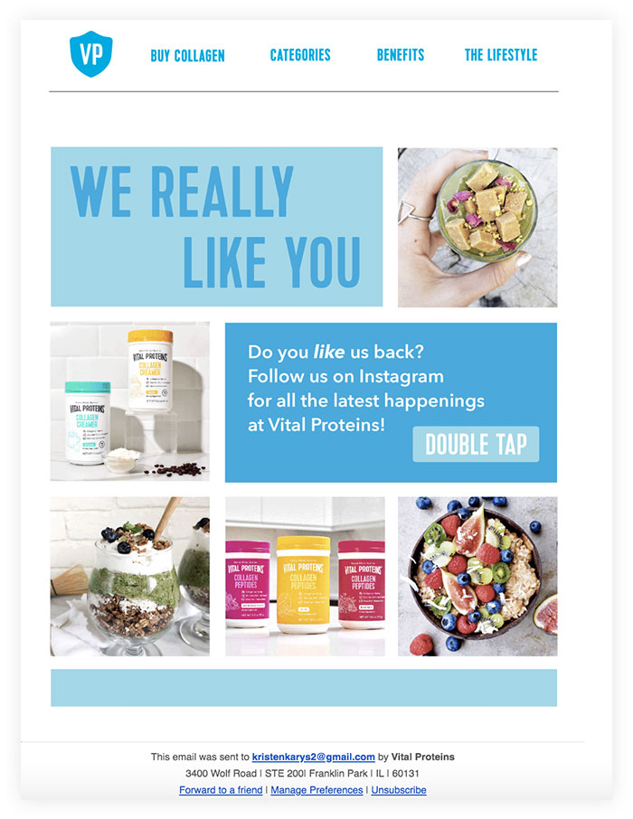
Although the Vital Proteins design contains lots of pictures and information, it has been carefully edited so that it is not overwhelming for recipients. The email’s colors, fonts, and images are on-brand and reflect the company’s products.
It has a prominent CTA that directs buyers to its Instagram pages – this type of CTA helps the company increase follower count and brand awareness on the social platform.
3 email design software to design compellin emails
Here are a few popular email design software that you can use to design email marketing campaigns effortlessly.
1. NotifyVisitors
NotifyVisitors is an automated email marketing platform that comes with a simple and easy-to-use drag-and-drop email builder that lets you create compelling email designs.
Popular features:
- WYSIWYG editor
- Drag and drop editor
- Re-usable premade content blocks
- 100+ free email template designs for inspiration
- Dynamic email content
- No coding skills are required
- And more.
2. Stripo
Stripo helps you with email design and development. However, it can’t help you with sending emails. You can make beautiful and rich HTML email designs with Stripo’s editor.
Popular features:
- Drag and drop editor
- HTML and CSS code editor
- Responsive and free email templates
- AMP email support
- Integrates with 70+ ESPs
3. BEE
BEE is another email design software that builds responsive and mobile-friendly emails and landing pages.
Popular features:
- Drag and drop editor
- Export templates anywhere
- Ready to use email templates
- No-code development
- Integrates with other ESPs
Conclusion
Email design plays a key role in the success of your campaign. No matter how grand a strategy you have, it will fail without a well-thought-out design. It is not just a simple solution like a simple poster; it is much more than that.
It needs to fit your brand, adapt quickly to marketing gimmicks, provide value, and resonate with your audience. In addition, modern trends say that it has beautiful aesthetics and a great user experience. That’s why it needs your close attention and the best tools on the market.
Schedule a demo with us and get inspired by real-life examples to create a perfect design for your email that turns users into real leads.
FAQs
1. What do you understand about email design?
It refers to creating compelling email elements that are relevant to your email marketing efforts and helps increase the ROI of your email marketing efforts.
2. What, according to you, are the most important aspects of an email design?
Many aspects form an important part of an email. However, the most crucial ones are logo, colors, header, pre-header, text, image, and CTA.
3. Does designing an email really matter?
Absolutely! Design is important in an email as it determines whether your prospects are driven to read and engage with your messages. If your design is effective, users will be more inclined towards your brand.
Also Read:


 Email
Email SMS
SMS Whatsapp
 Web Push
 App Push
 Popups
 Channel A/B Testing
  Control groups Analysis
 Frequency Capping
 Funnel Analysis
 Cohort Analysis
 RFM Analysis
 Signup Forms
 Surveys
 NPS
NPS Landing pages personalization
  Website A/B Testing
  PWA/TWA
 Heatmaps
 Session Recording
 Wix
Wix Shopify
 Magento
 Woocommerce
 eCommerce D2C
  Mutual Funds
 Insurance
 Lending
  Recipes
  Product Updates
 App Marketplace
 Academy

