If you are here, you might want to learn about conversion rate optimization strategies. You might want to know about the ‘quick hacks’ and the ‘best conversion techniques’.
Forget about all of it, because there is no shortcut to getting the conversions right. In this article, I will give you a detailed description of the ways and techniques that can give make your conversion optimization better.
A friendly disclaimer: Every business has its own risk, but all you need is a heart to explore. And, every time you take a step, think yourself as, of a customer.
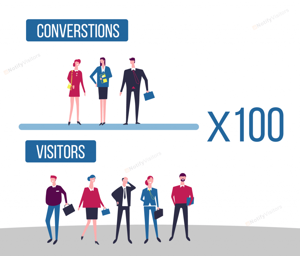
You have built a great business with all your heart and hard work, but you have a hard time to get the customers or clients. And this might be giving you sleepless nights; we all crave for tons of traffic to turn to our websites. But converting that traffic into conversions is the real deal.
Conversion Rate Optimization is one of the fastest and the most effective ways of turning your visitors into customers. There are a lot of things to take into consideration for CRO, but it is not rocket science once you know the right strategies.
Contents
What is Conversion Rate Optimization?
CRO is the process by which a business converts its visitors into paying customers for the available offers. In general, to maximize the number of people to take the desired action. Conversions depend upon the business or the website you are handling.
If you are an E-commerce site, your conversion will be on the purchase of a customer.
If you are a blogger, your conversion goal should be to make people sign up for your newsletter.
How to calculate Conversion Rate?
CRO= Number of Conversions/Number of Visitors X 100
For example, if a company had 20 sales last month and the visitors were 400. Thus the conversion rate would be 5%.
Many statistics and analytics state that an average conversion rate lays between 25 to 5%. But that is not true. Different businesses, different audiences, and various conversion goals.
Some people ask the question of what a reasonable conversion rate is. And answer to this is “Better than the previous month.”
A handy
tip: Every step of your user’s journey is a new opportunity for you. Make sure you make it easier, shorter and enjoyable.
Now is the right time we dive in and learn some useful conversion rate optimization strategies.
Conversion Rate Optimization Strategies
1. Landing Page
The first impression makes the last.
The landing page tops the priority list. All that is on the landing page will be the first thing that a visitor will see. Make your landing page attractive; give your customers a reason to stay.
Use your top products on display. Use beautiful imagery and attractive headlines. Don’t go over the top and don’t keep it minimal.
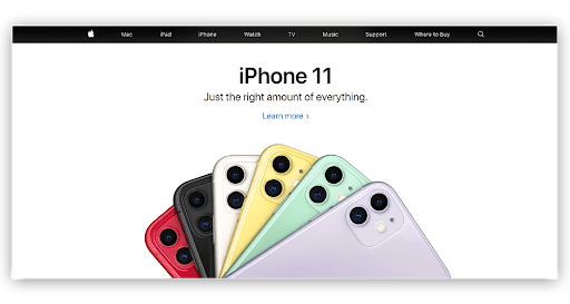
Just as Apple’s landing page. Their Navigation bar shows all the services and products they provide also the recent product makes it to the top. The page is simple yet informational.
Content is the King~ Bill gates.
2. Irresistible Content
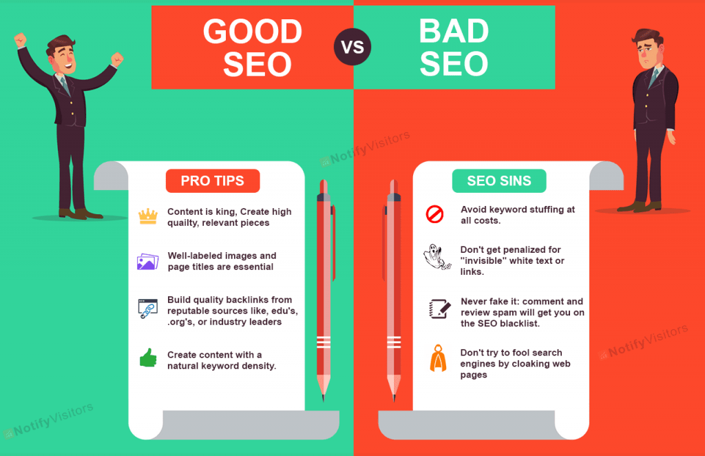
This is the famous line from the billionaire himself. Too few words can get people in a dilemma. And irrelevant articles can get people off the topic.
Try and deliver just right. Good content is the only thing by which you can explain all about your products and your brand. So, make it right. You should never leave the visitor in any doubt.
SEO (Search Engine Optimization) for the rescue. Get the help of SEO for making your blogs and websites to the top of the page by writing good content.
3. Fewer Form-Fields
Studies say that the more you will ask your customers to fill in the details in the form, the less are the chances they will get you any subscriber or a purchaser.
As a user visits your site don’t ask them to fill in the credentials which got many fields. If you want a subscriber, all you can ask; is to fill in their names and email address.
The less the form fields the more chances are of you to get higher conversions.
Why ask for their date of birth or age during the checkouts. Right?
4. CTA (Call-to-Action)
Grab their attention.
Call-to-Action plays a significant factor in getting your conversions. CTA is not art. It may seem like it is all about colors and demographics but, it is more of a science. Human psychology plays a notable role here.
You need to learn what attracts people. Is it color red? Is it the big buttons?
It could be many things, but the primary factor is to make them contrast with your website. Don’t use colors that don’t go well with your website.
Also, use researchers say that use only one CTA per page—going extra can ruin things.
5. Imagery and the Banners
Many of you might think that slider images are cool and look good on your wall. But according to researchers, the sliders’ images are a distraction that a user doesn’t want to come across.
As images slide over and over again, it gets difficult for the users to browse and explore the page. Big banners are too a big issue that people complain about. Banners should never become a hindrance to the user while browsing, and also a banner should always have an option to close it.
Use images relevant to the content.
6. Descriptive Headlines

A headline is something that is heart to the content. A headline should be written using catchy words and it should be brief yet descriptive enough to let people know insights into the content.
Make a headline this good that the reading the further content becomes irresistible to the customers. As you can see the same newspapers with the same pictures but have different headlines.
A headline can make a major difference in the content that can make or break the brand.
7. Urgency

It is a human tendency when they see that something is getting over soon. Like there is only a day left or a few products available in the stock, they will rush to buy them.
Use timers and count downers to create urgency. Give them a reason to buy that product.
8. ‘FREE’—is the holy word

The words like Free, Discount, and Sale leaves a big impact on the mind of the customers. People go crazy when they see a product is at a discount or whenever a big sale is going on.
Make this a practice of making your products on the sale once a month so that customers keep coming in.
9. Testimonials
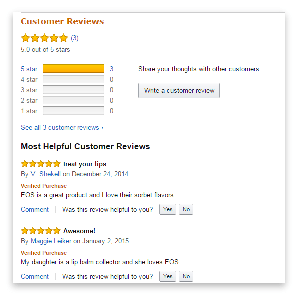
Word of the mouth plays a big role in the world of business. When your existing customers will spread the good word about you to their friends they will also gain trust in you and so will become a customer of yours.
Similarly, add a review section to your product of yours to maintain trust. When people will review or rate the product this will make you more trustworthy. If you want to find out how to get reviews, then you should definitely take a look at this guide: How to Get Reviews on Amazon.
10. Heatmap
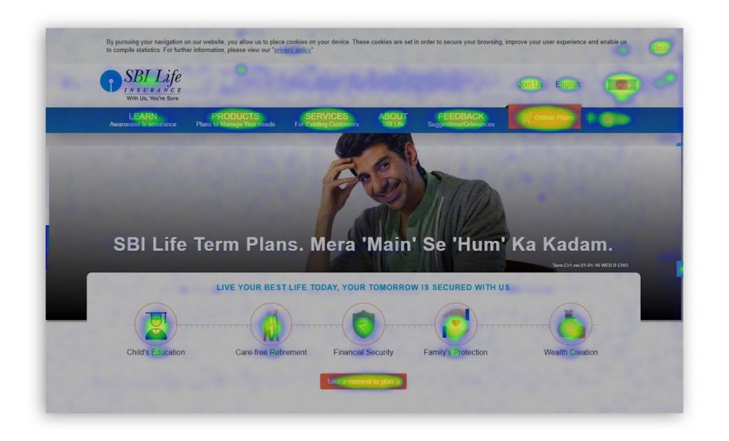
This is one of the most amazing discoveries in the world of marketing automation. This is the tool that tracks customer behaviour in some of the best ways.
Implementing a heatmap on your webpage can make your work on your flaws and improve them as per the customer’s engagement activities.
Read more about: What is a Heatmap?
11. PWA (Progressive Web Apps)
PWA is something new, and the most talked-about technology in the IT world. Every small scale businesses that are constrained to the webpage only and got not have many resources to maintain and create an application are the ones who are making the best use of PWA’s.
PWA’s are the icons on your home screen, that acts as an application but are not.
They are fast and reliable. Also, the people who don’t have much memory in their phones can make the best use of the PWA.
12. Run tests on your Webpage
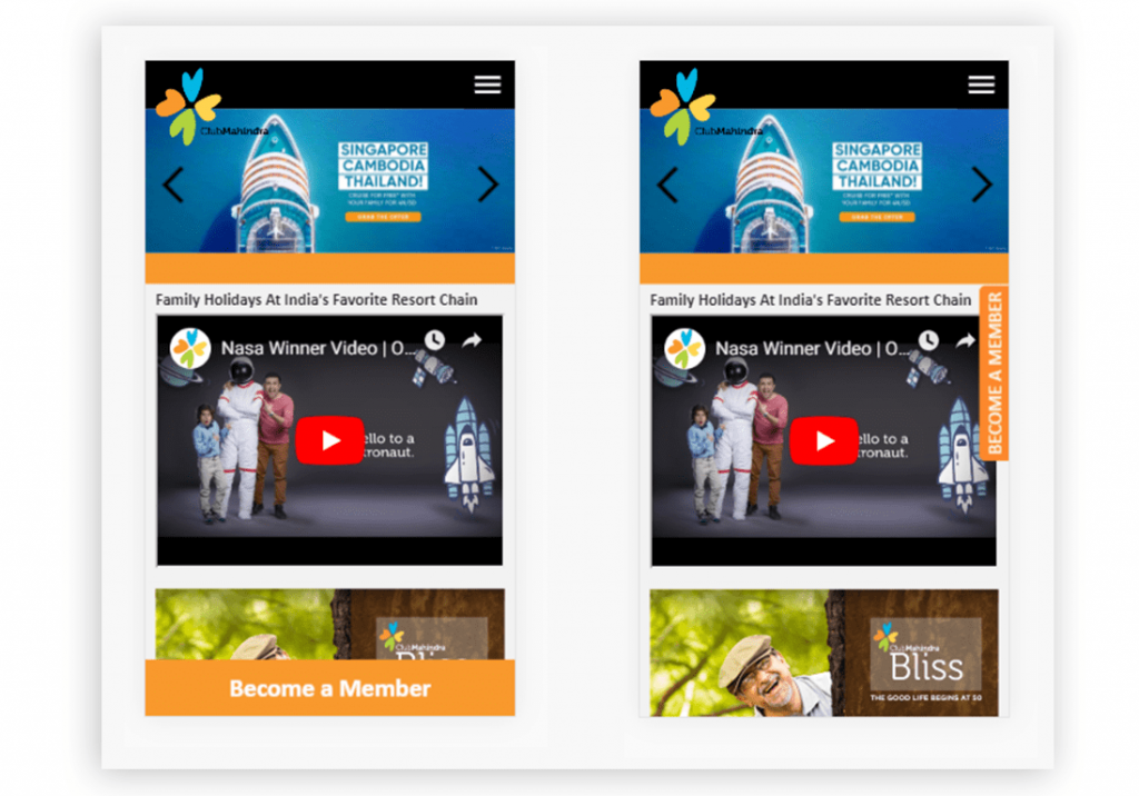
Nothing is ever perfect. Everyone has some flaws and so the website can have it too.
You may have to build your website with all the hardship, but it is a possibility that it might not be keeping up to the customer’s preferences. Thus, comes the role of A/B testing.
A/B testing lets customers see the two variations of one webpage, and by this, you may know which one is getting better engagement. And further you can apply the changes to your website.
13. Emails/Text Notifications

Keeping in touch with your customers creates a sense of personalization. Keep your customers posted about the new deals and the new updates on your websites. Send them SMS, emails and notifications (considered the best).
Sometimes the user stops using your website or maybe they had abandoned a product in the cart for a long time. Thus, come your duty to send them an email or a push notification to remind them so that they can come back.
14. Final Checkout
This is the major and the trickiest part. Here comes the customer’s journey to an end. Now with all the purchases user will now checkout from the webpage, this is the time of the payment and the final conversion.
Make the payment process easy and hassle-free for the customer so that they won’t abandon the cart.
Don’t put in many form fields or ask for irrelevant details. Keep it simple with interactive CTA’s.
Conclusion:
By the end of this blog, you might have some useful conversion rate optimization strategies for yourself. Implement those strategies onto your website, to increase conversions.


 Email
Email SMS
SMS Whatsapp
 Web Push
 App Push
 Popups
 Channel A/B Testing
  Control groups Analysis
 Frequency Capping
 Funnel Analysis
 Cohort Analysis
 RFM Analysis
 Signup Forms
 Surveys
 NPS
NPS Landing pages personalization
  Website A/B Testing
  PWA/TWA
 Heatmaps
 Session Recording
 Wix
Wix Shopify
 Magento
 Woocommerce
 eCommerce D2C
  Mutual Funds
 Insurance
 Lending
  Recipes
  Product Updates
 App Marketplace
 Academy

