Popup notification has many faces and functions. But their primary role is to draw more customers. Their appearances change as per their functions and use. They pop up on the desktop screens and mobile screens in the form of-
- Toasts
- Notification Bubbles
- Desktop Notifications
- Snack bars
- Passive-Popups

No matter in what form the notification appears, it points towards a graphical control. The graphical control elements- buttons and scrollbars communicate and lead users to events.
The popup notification may demand immediate attention and prompt you to action. Or, it may give subtle reminders, tips, or the information and go away.
Contents
Why Do You Need to Use The Notifications At All?
Notifications on websites and apps interact with the user and give them feedback-
- Information
- Indicators
- Warning
- Error
The users can plan better or avail of the current or prospective opportunity.
Let’s take a real-life example that everyone is familiar with. Your car’s dashboard comes equipped and designed with small icons that notify you and others about something.
If your car’s fuel tank is nearing empty, it showcases and prompts you by lighting up the red area. If you turn on your headlights, there is a sign for that too.
At a glance, you know what the situation is with your car at any given time. When you take a turn at a signal and pull up the lever, all vehicles get notified.
If you pull the handbrake a lamp lights up, or if you have not released it when you start driving, the indicator for it is on.
Getting Notified Appropriately
So, it is not only about getting notified but how you are notified is also important. If you, in the driver’s seat, did not wear your seatbelt, the buzz goes on until you use it.
Some cars are voice and camera activated. The navigation panel shows and speaks out the direction from point A to B. If you take a wrong turn it lets you know. In case you know a shortcut and go out of the directed way, it will take your turn as amiss.
It will keep prompting you that you took a wrong turn. If there was no way to opt out of the speech mode, you’d continue to hear the error notification till the end of your ride.
So, each notification fulfils a different purpose and it appears, looks stay on accordingly.
How Can Popup Notifications Help you?
They are specifically used in marketing techniques to-
- Gather The Feedback From Customers
- Convert Abandoning Visitors
- Collect Blog Subscribers
- Make Announcements Of Special Deals
- Conduct Marketing Research
- Sell More Service Subscriptions
What are The Different Types of POPUP Notification?
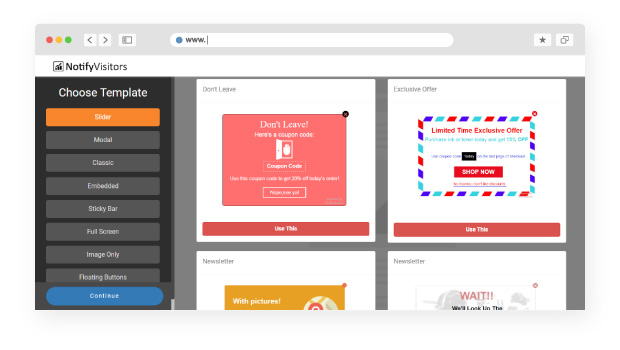
1. SLIDER Pop-Ups
Slider Pop-up notifications take little space to communicate an important message. They contain rich HTML content. They come with options for embedded images, videos, and hyperlinks in the description.
They help in marketing promotions, targeted offers, and new product launches.
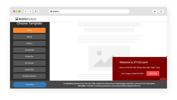
Show pop-ups in the admin dashboard: You can use them on the dashboard as well. For instance, say are targeting boosting up a subscription. If the user selects the monthly plan, you can use a pop-up to suggest an annual plan with a 15% discount.
2. Modal Notifications:
Some notifications need prompt action and they freeze your entire web page. They will interrupt you and pop up in the middle of your web screen, and only after you click your choice, do they go away.
They are rich in HTML content and appear with transparent backgrounds and blur out the page you are on.
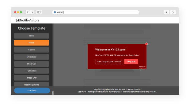
Modals notifications grasp the attention of the user. They notify them of an error or a state requiring immediate action. They compel the users to acknowledge the message before they click on an option.
Grab the attention of the User:
A modal message interrupts the current task of the user and draws complete attention to something more important.
- Exit-Intent Reversed: When the user is about to exit the site, the pop-up intervenes and prompts to register.
- Need User Input: When you need the user to log in to a form or signup
- Show detailed info in context: When you want to show an enlarged version of an image or a video on a shopping site or gallery
Show unrelated information: Show important notifications, not relating to the current page. You can create calls to Action or CTAs that correspond with the page content.
Do A/B testing by simply split testing your creative, content, and CTA and see what best works for you. Also using Heatmap will help you know your user actions after they close your pop-up.
3. Toast Pop-Up Notifications
Opt for toast messages to communicate the successful interaction of the user with your app or web interface. Toasts appear only for about 5-6 seconds, fill in the size of their content, and do not block the content behind. They usually come in the form of text or icons or both.
Use toasts when you-
- Send a message- you receive a toast message saying “Message Sent”
- Delete Emails- you receive a “your message has been deleted” toast message
- For ongoing action- When you are “Sending Message”
4. Widget
You can use a widget for “Contact us” at the bottom of every page. It is 3 to 5 times more successful in getting messages than having it as a link at the bottom of a page. It is a more transparent method of communicating and brings customer trust.
5. Embedded Pop-ups

They are quiet pop-ups that do not disrupt the visitor or reader. They carry out their function and convert your visitors to customers or subscribers. They are used in journals, newsletters, and websites. They may even include a survey.
6. Sticky Bar Pop-ups
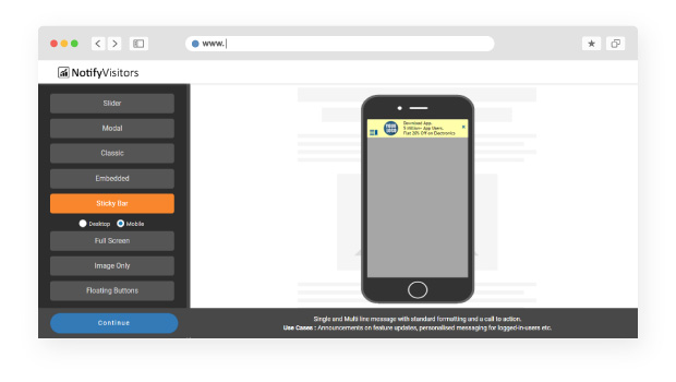
Sticky bars are the subtle and both mobile and desktop-friendly pop-ups that “stick” to either the top or the bottom of a page. They remain situated with the visitors as they continue to scroll through the page.
They allow you to keep your announcements and offers on top of the visitor’s mind. Stick bars work well with Google’s ranking for mobiles. They create mobile and SEO friendly browsing experiences.
7. Full-Screen Popup Notification
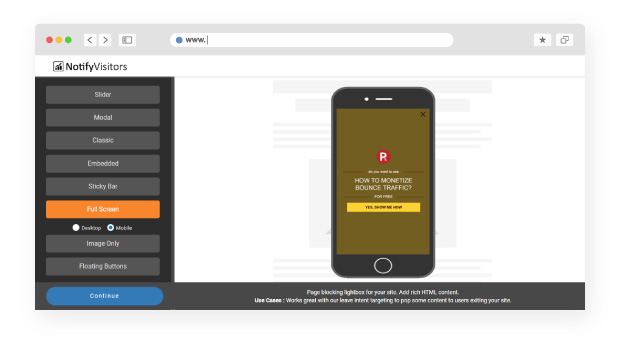
You must use the full screens carefully. They must be engaging one way or another. If you are putting up an offer-
“Would you like a 25% off?” and place two buttons giving the option of “Yes, I’m in” and “No thanks”, almost all users would opt for “Yes, I’m in.” Or putting in an offer such as “How to monetize Bounce Traffic? FOR Free” and a button giving an option “Yes, Show Me the Way” will work well.
8. Image Pop-ups

Image pop-ups with useful info are most effective when they show up on pages with intense reading. They especially work well for Free offers as users like freebies.
Image pop-ups go well as infographics for giving useful information or advice. You can answer some popular FAQs or show your unique product if you have an e-commerce site.
9. Floating Buttons
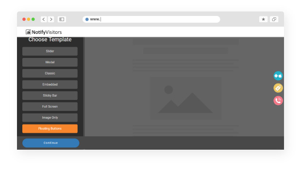
A floating action button or FAB stays placed on the side or appropriate area on the web page. They trigger an action on the same page or create a new page. A FAB helps to stimulate a constructive and important action like Favorite or Create.
It appears in front of all content on the screen as circular in shape. FABS comes in three types: regular, mini, and extended. FABs are only used if it is the best way to present the primary action on the screen.
10. Desktop Alerts
Desktop Alerts are pop-up notifications used in corporate offices to notify the employees. They appear on the employee’s screen after the employer creates, configures, and sends it.
What is a pop-up notification if it is not accessible? The desktop Alerts are effective as they can appear on the mobile screen or desktop screen of the employee. You can send desktop alerts after installing the application.
They are an instant, sure and direct method of communicating with your employee. You are not left constrained to the email system. They allow you to send vital information to the staff immediately.
Time and Event-Based Pop-ups
Some pop-ups appear after a certain time when a visitor enters your site. They could be timing or event triggered. Let’s take a closer look-
a) Scroll Pop-ups
As the user scrolls a page, it triggers the scrolling pop-up which slides in immediately. It is very helpful in creating your readers to subscribers.
The scroll pop-up is helpful in converting the users who come upon your page organically. At the least, they become email subscribers if not customers.
When a visitor has read a certain amount of your site content, say about 30%, the pop-up slides in. You could tune it in with appropriate matter on the page, so it may be of use to the visitor. The scroll-up pop-up can enable 30% conversion especially if it is organic driven.
b) Delayed Pop-ups
Delayed pop-ups appear after a preset time delay once the visitor has entered the page. When the visitor has spent a certain amount of time on the page, the delayed pop-up appears.
The timing must be perfect- neither should it enter too soon, nor too late, or it may repel the visitors. If it appears as soon as the visitors enter the page, it may annoy them, and they may leave. Or, if the timing is too delayed, the visitor may leave and never get to it.
So after the visitors have read a certain part of the content, they would want to know about special offers. That is when the pop-up should appear. Appropriate timing can be set anywhere between 10 to 30 seconds.
c) Interaction Based Popups
Interaction based pop-ups create personalized experiences. They only pop- up when a visitor clicks on a link or places the mouse over specific content or image on the page. The interaction-based pop-ups allow you to create personalized experiences for your visitor.
They appear when a specific action takes place. You can hence reach that user category with appropriate offers or messages.
So now you know what is a popup notification and its scope, behaviour, and uses. We can use different types of notifications and apply time or event conditions. Also, we can display appropriate pop-ups to organically driven customers.
We can use pop-ups effectively for the call to action. Furthermore, you can enhance your pop-up information, timing, and display with feedback. You can use features like A/B testing and Heatmaps that study user interaction. This will help to increase the CTAs.
After all, what is a pop-up notification if it cannot increase your sales? The primary function of the pop-ups is to drive more sales.
Conclusion
So no matter if you sell services, are completely in sales or are an owner of an e-commerce company, you can increase your sales with the effective use of pop-ups.
The CTA buttons help to convert visitors to customers and grow your email list. It is important to set the triggers properly as they help to increase sales. Apply them to enhance the user experience and engage your visitors. So go ahead!


 Email
Email SMS
SMS Whatsapp
 Web Push
 App Push
 Popups
 Channel A/B Testing
  Control groups Analysis
 Frequency Capping
 Funnel Analysis
 Cohort Analysis
 RFM Analysis
 Signup Forms
 Surveys
 NPS
NPS Landing pages personalization
  Website A/B Testing
  PWA/TWA
 Heatmaps
 Session Recording
 Wix
Wix Shopify
 Magento
 Woocommerce
 eCommerce D2C
  Mutual Funds
 Insurance
 Lending
  Recipes
  Product Updates
 App Marketplace
 Academy

